A collection of branding highlights for campaigns in the public health and government sectors, product packaging, and print design.
2018-2026 @ MDC Design under the creative direction of Michelle D’Cruz.
Branding and Print Design

On this page:
Campaigns: Ask Again, MRSS, Cities for DACA, Cincinnati Parks + Rec for Wellness
Packaging: Cincy Sips
Print Design: Assorted reports
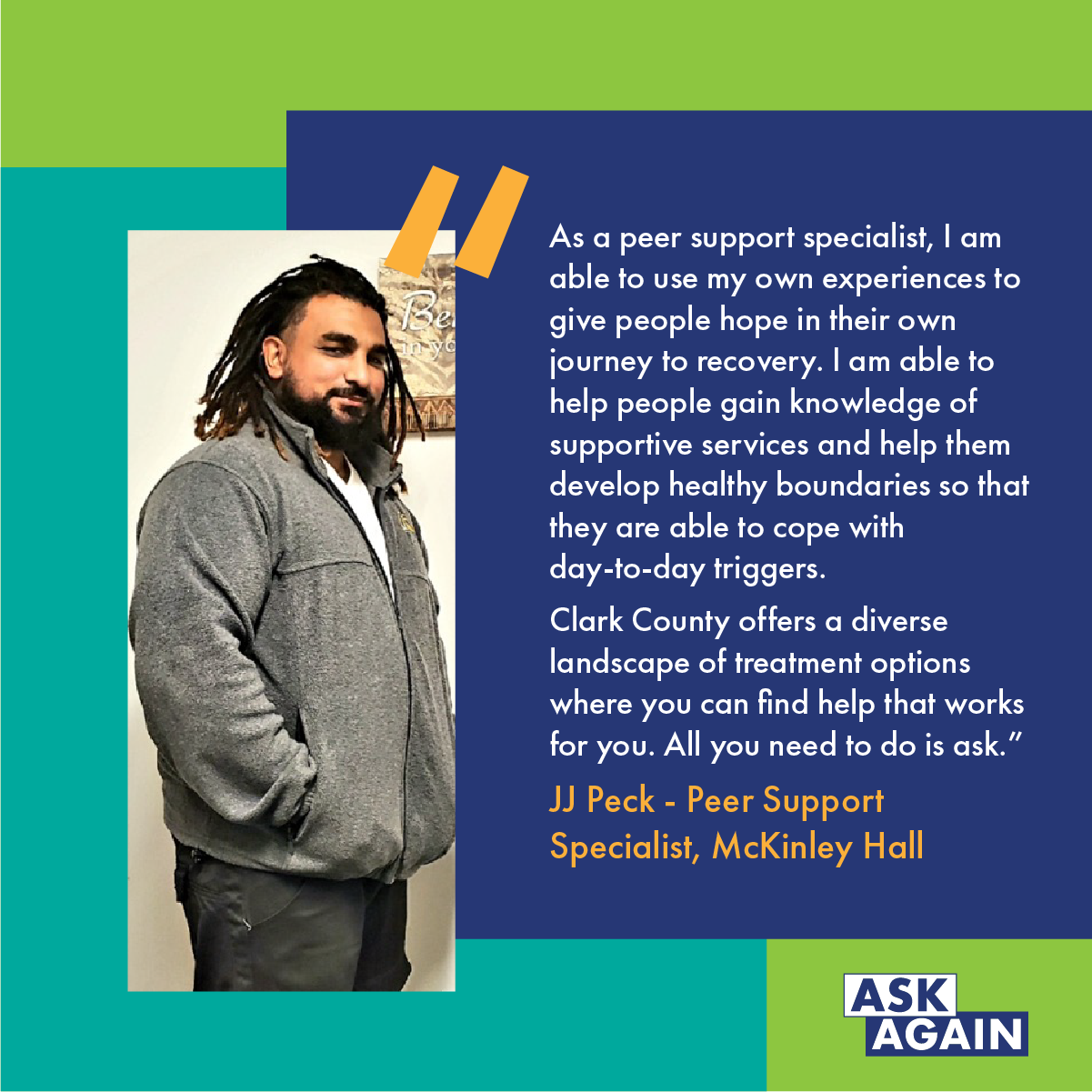
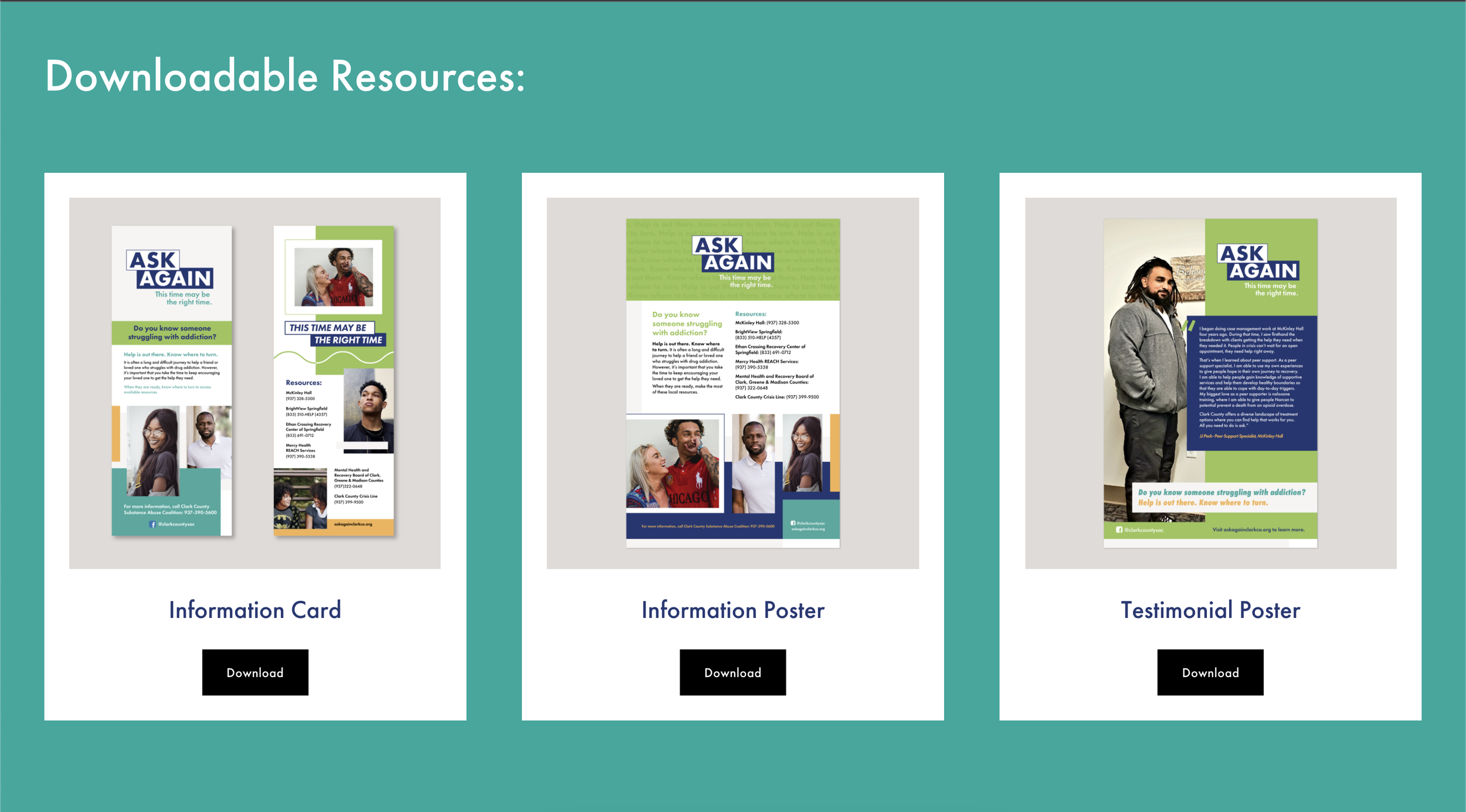
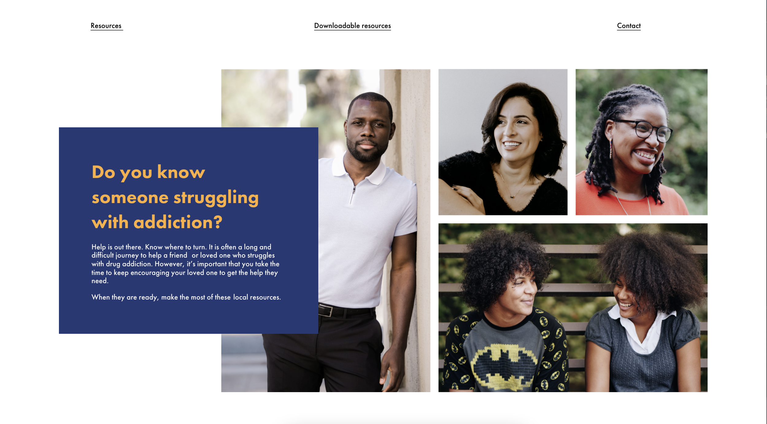
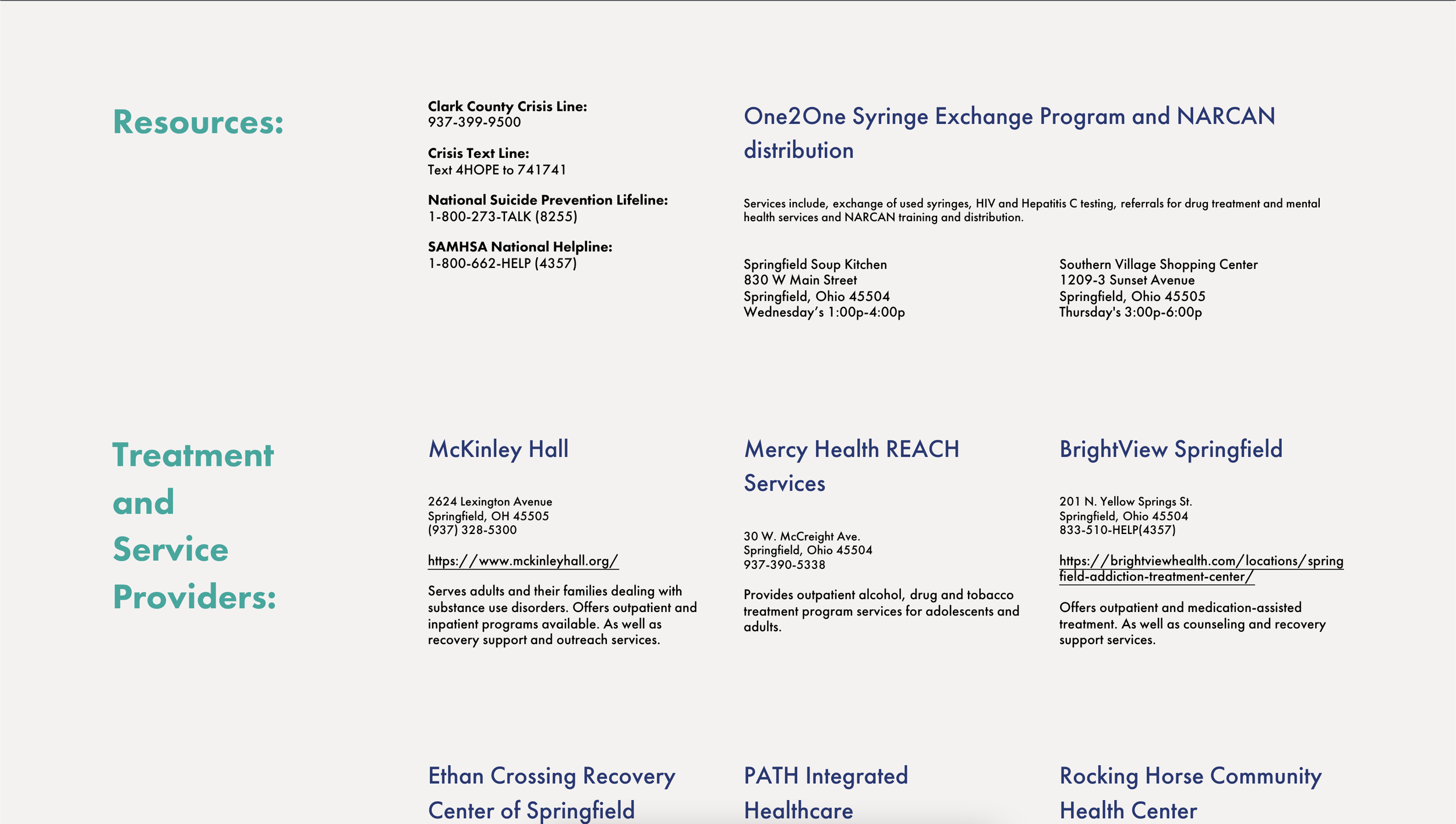
Ask Again Campaign
A public health campaign providing resources for folks struggling with substance use disorder in Springfield, Ohio, northeast of Dayton.
Campaign ➤ I developed the wordmark, color palette, and style board for the program, and implemented the visual approach across a suite of social media ads and posts, printed materials, and a website.


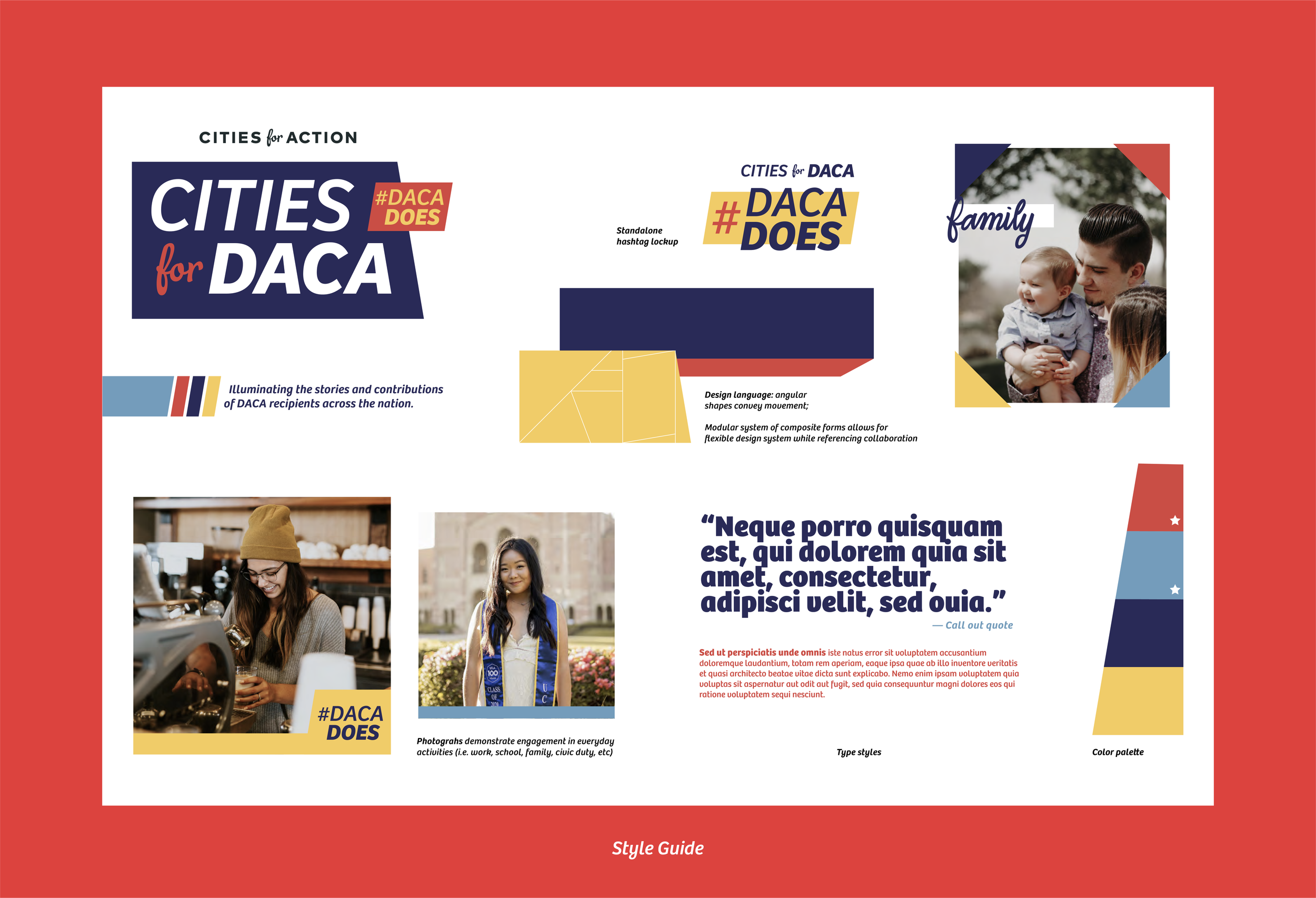
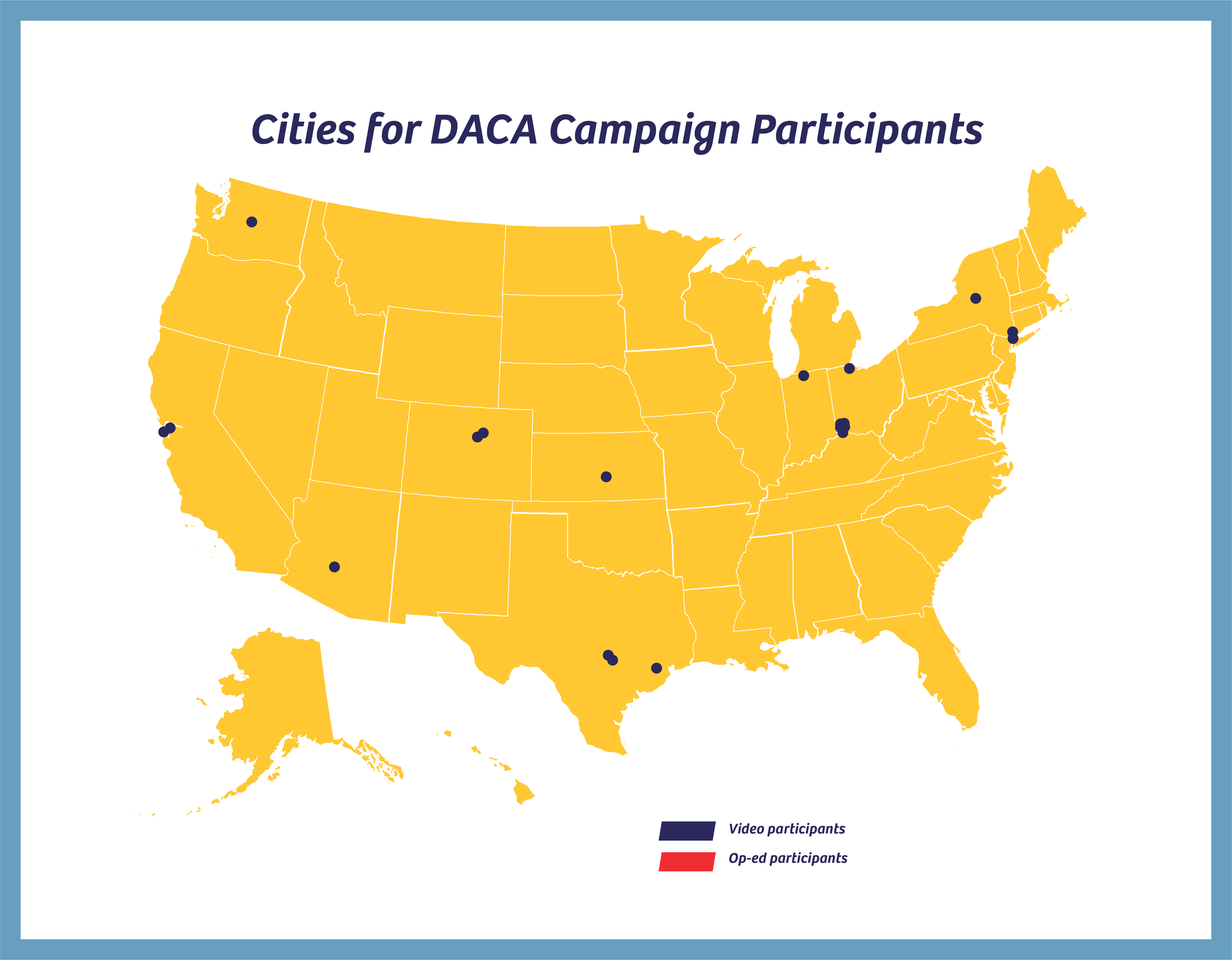
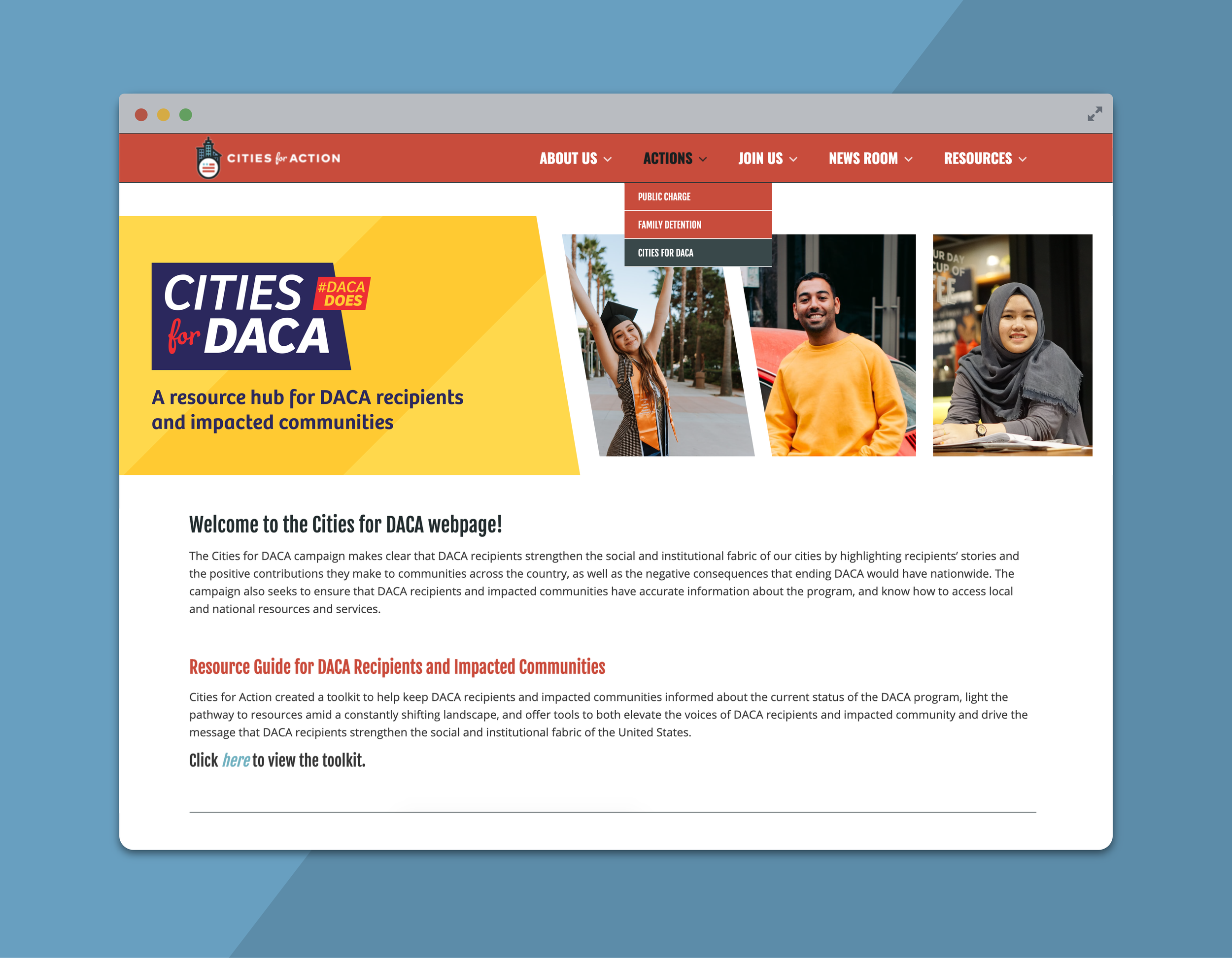
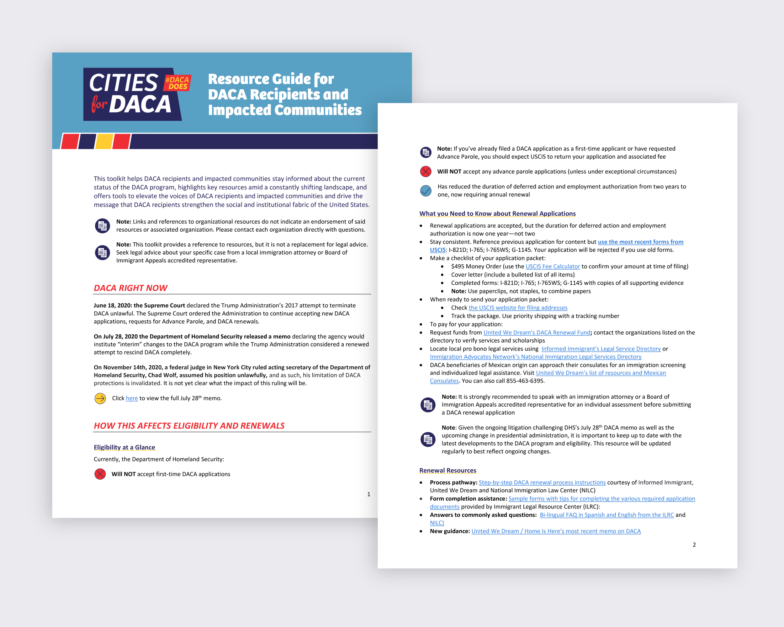
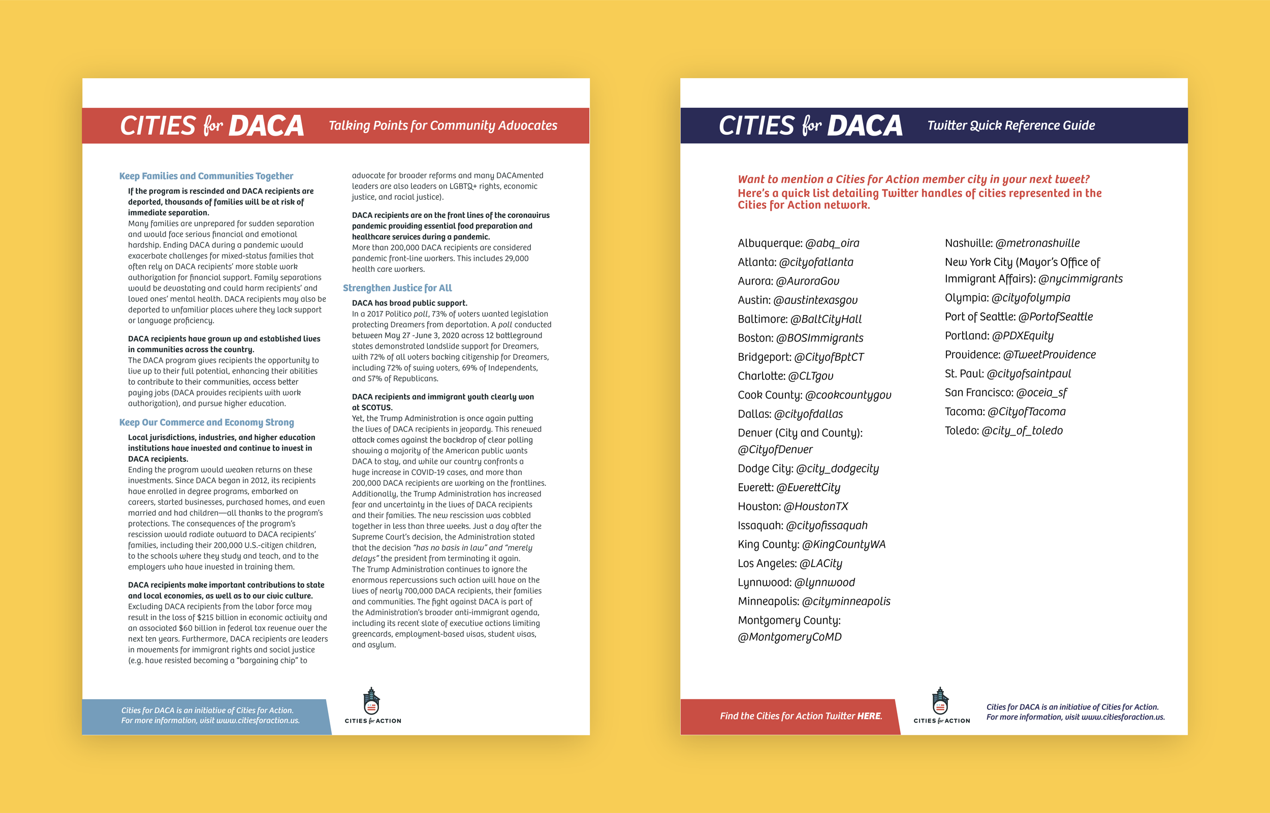
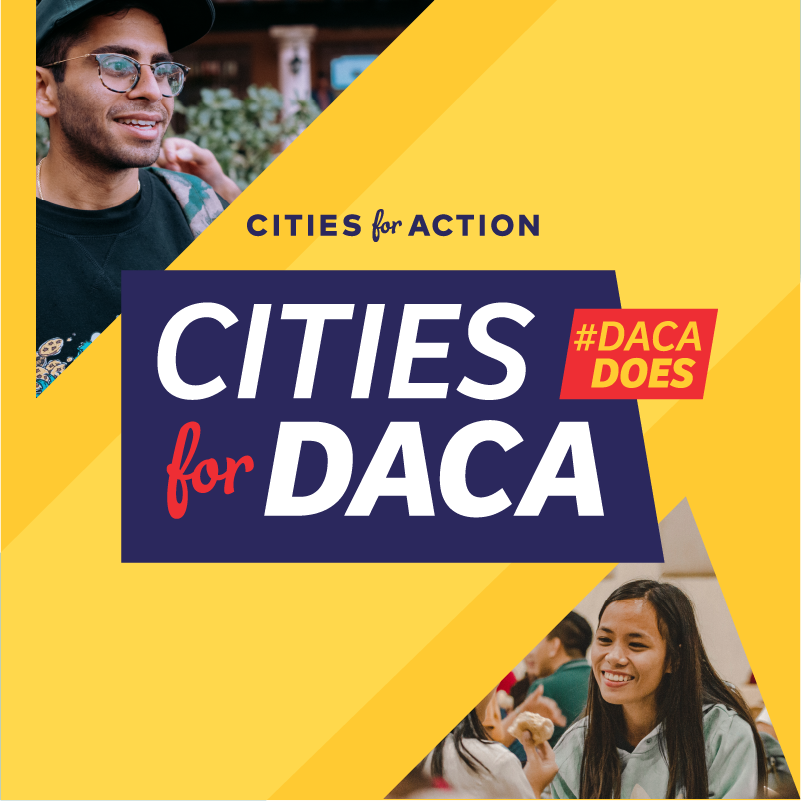
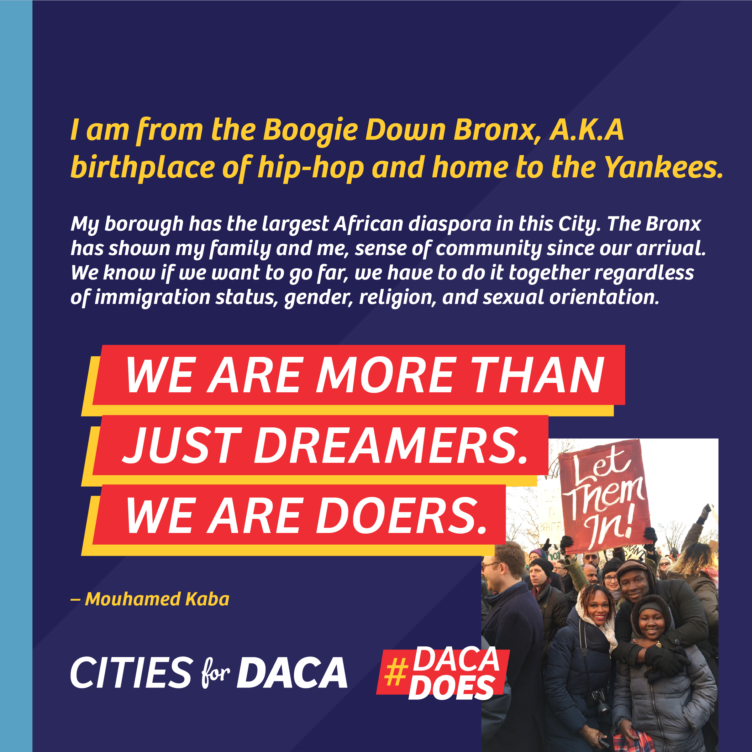
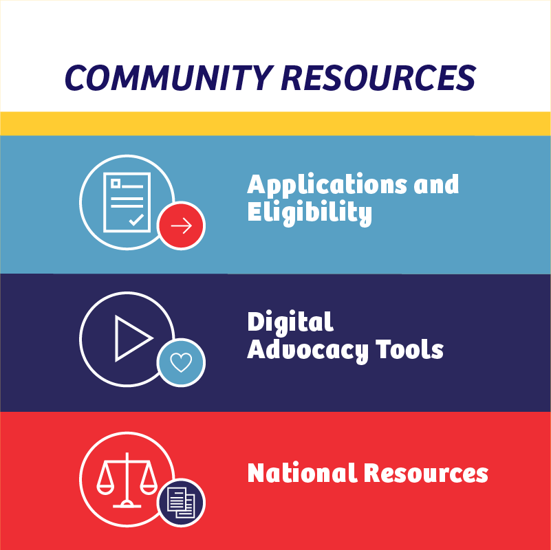
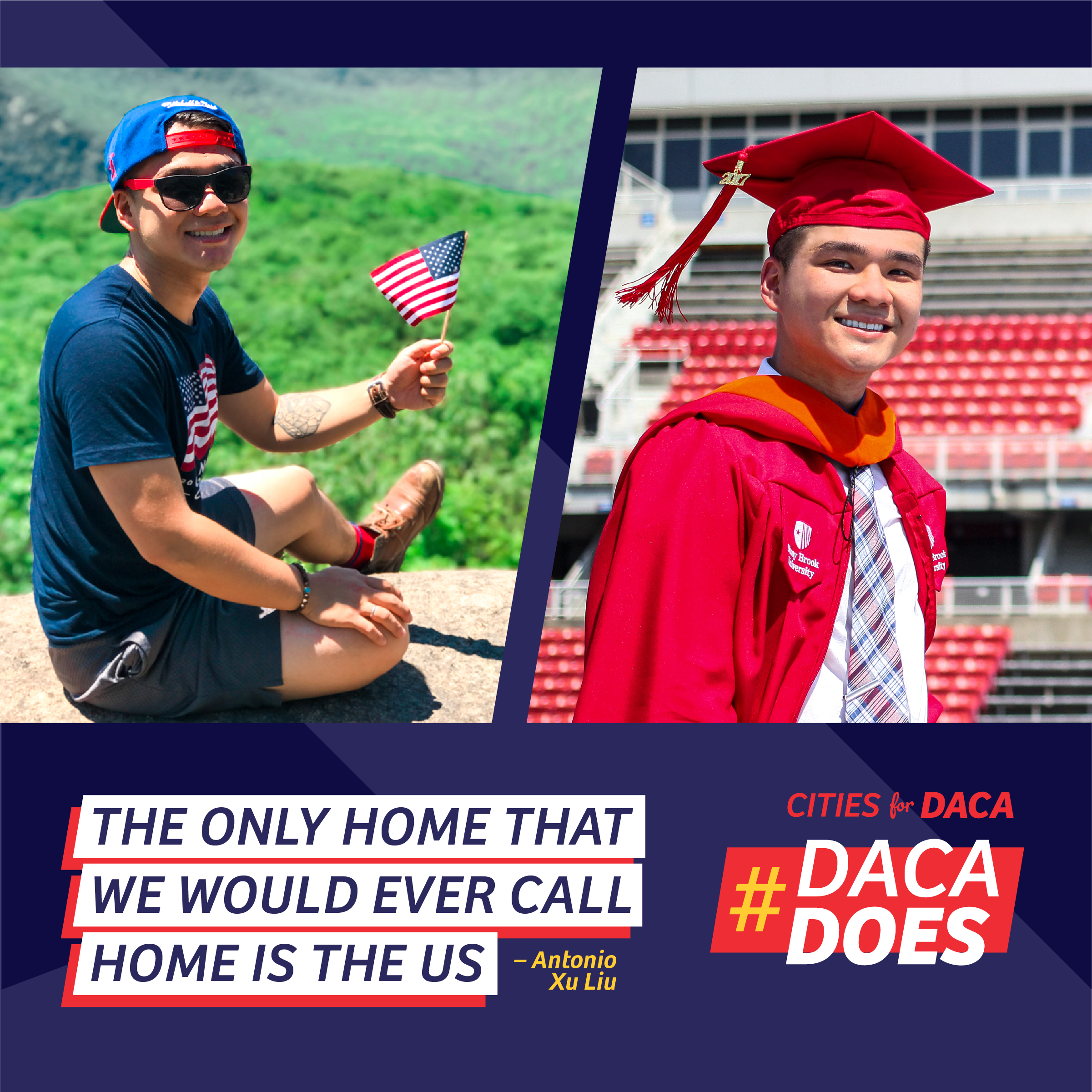
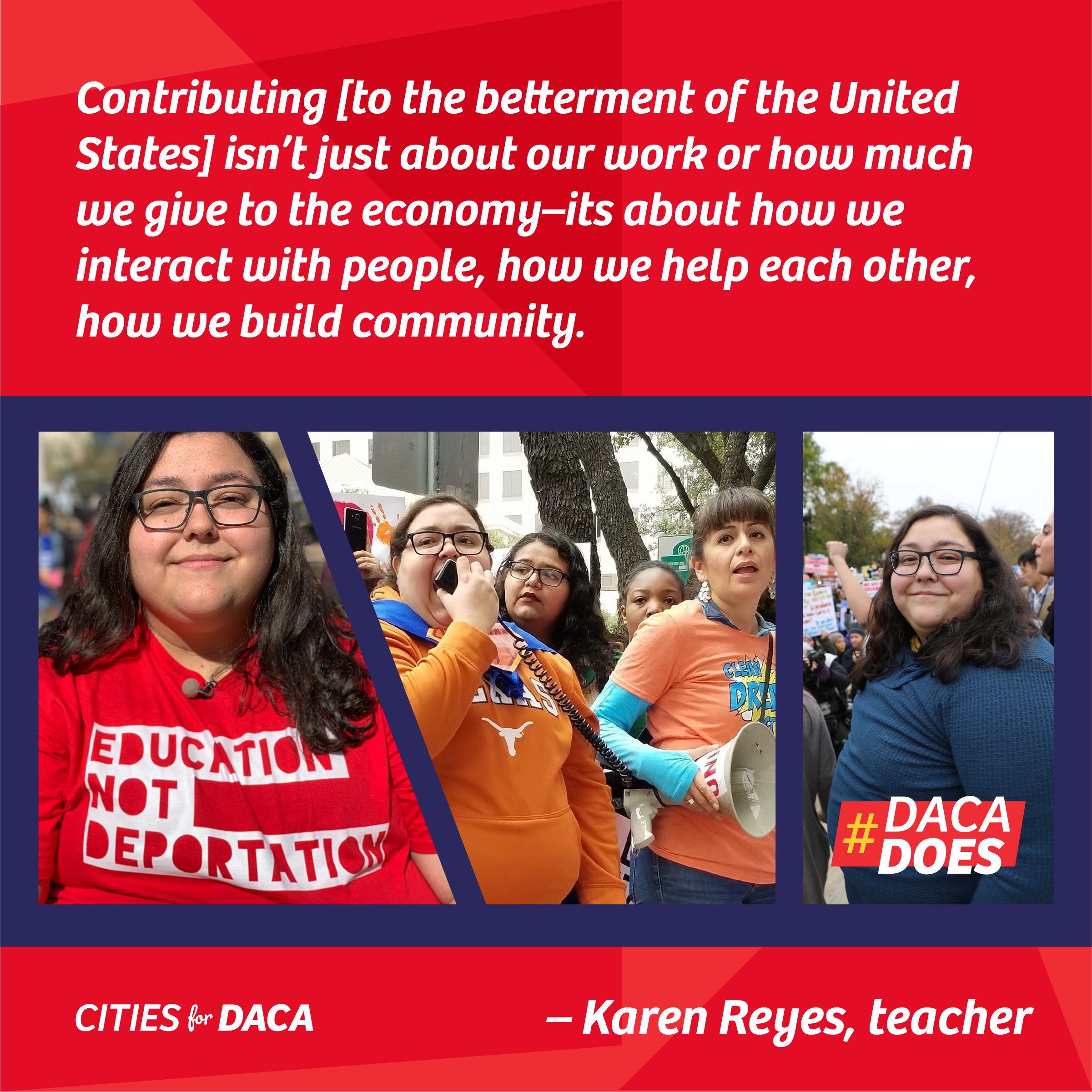
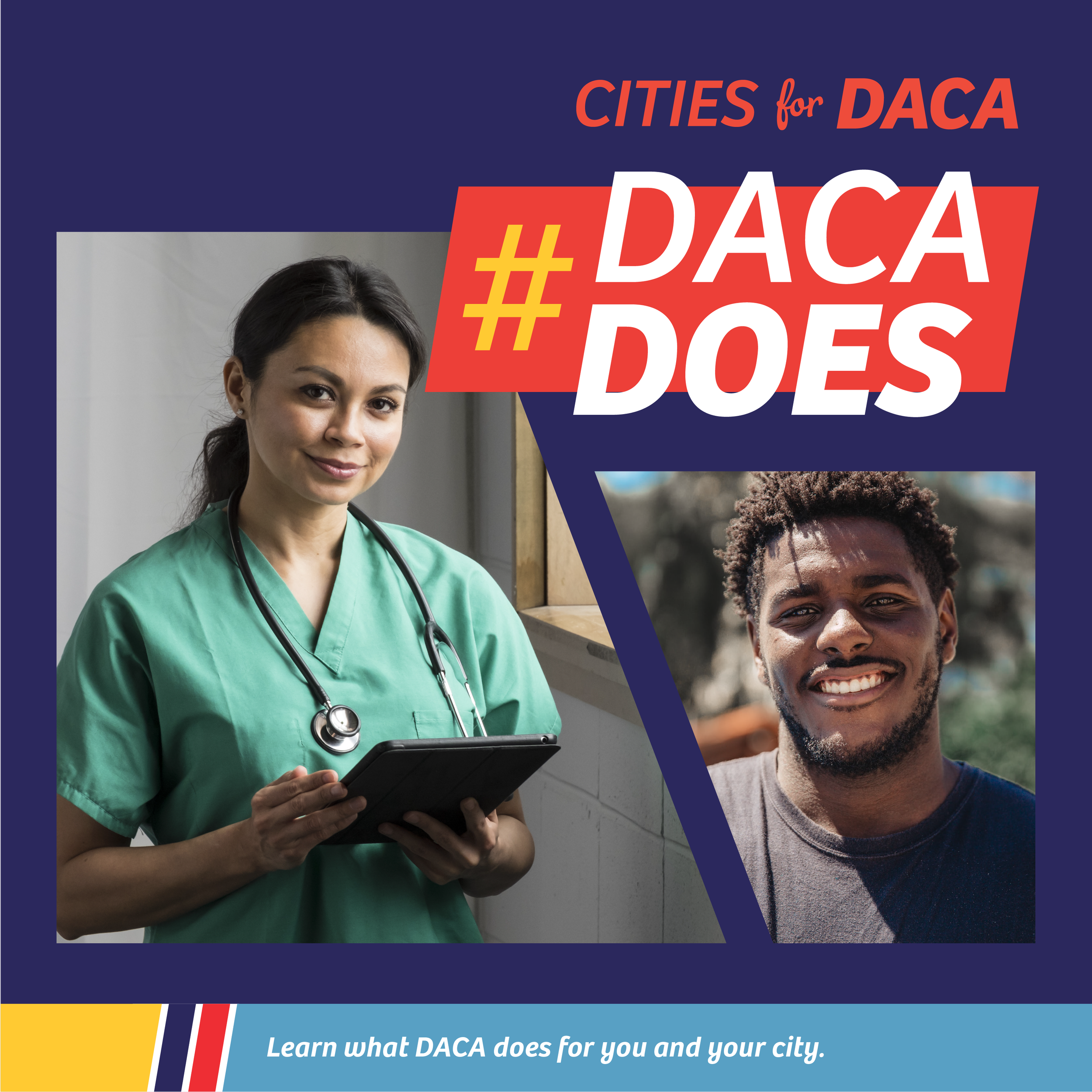
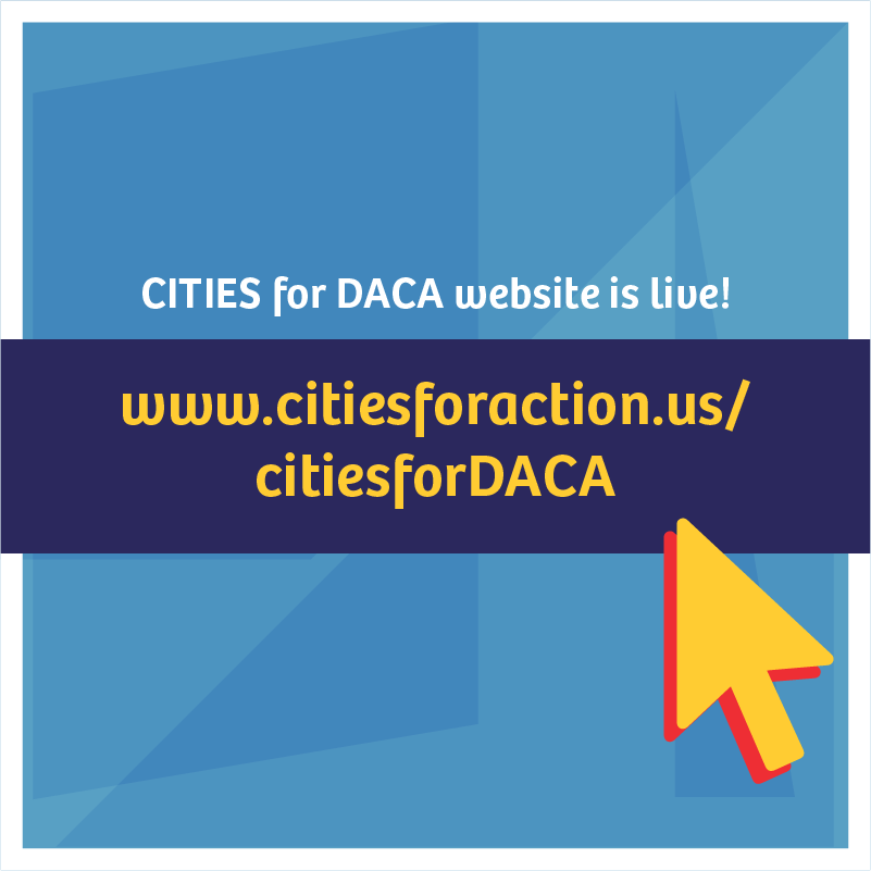
Cities for DACA is an initiative of Cities for Action, a coalition of nearly 200 U.S. mayors and county executives across America advocating for pro-immigrant public policies and launching innovative, inclusive programs and policies at the local level. Cities for DACA celebrates the achievements of DACA recipients and highlights why American needs them. The campaign lifts up the stories of how DACA recipients strengthen our economies, educate our children, care for the vulnerable, and enrich our communities.
Campaign Branding ➤ I developed the logo suite, style board, and color palette based on the existing Cities for Action brand guide, maintaining the red and light blue, and introducing the deep navy and the bright yellow to differentiate, using royalty free stock images of joyful Latinx folks in everyday settings
Marketing Materials ➤ I applied the campaign styles to website banners, social media graphics and ads, website banners, resources and toolkits, and Word templates
Cities for DACA


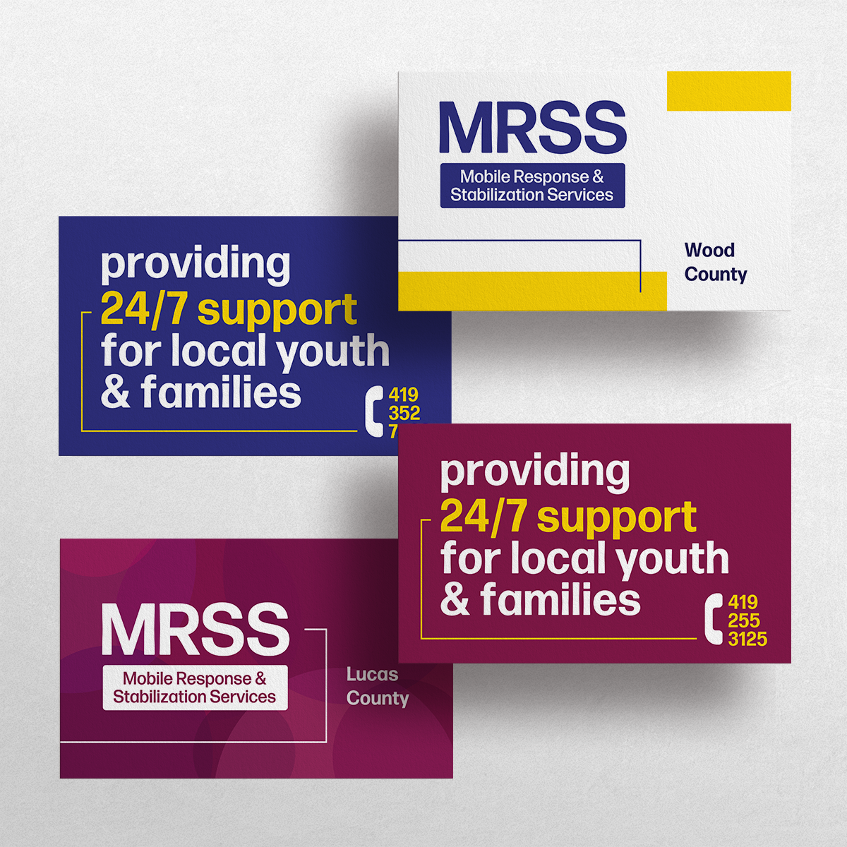
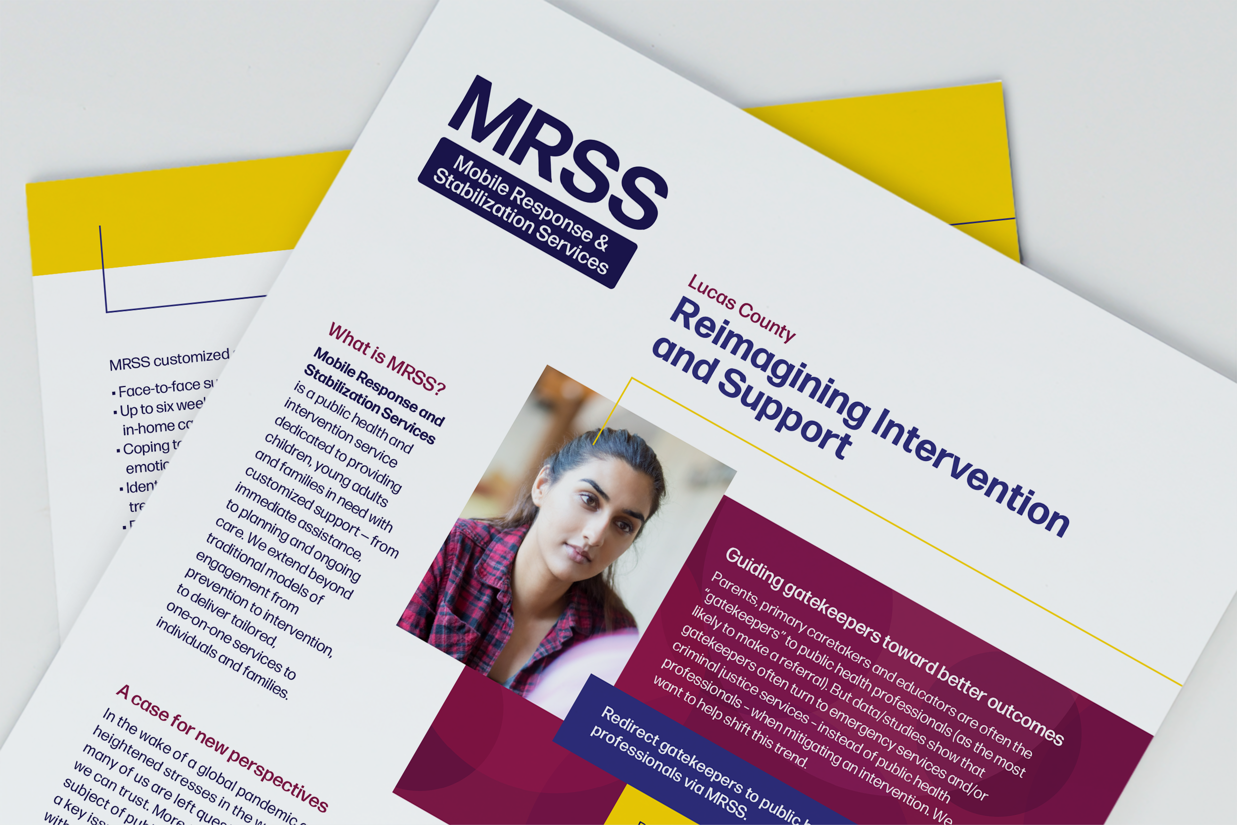
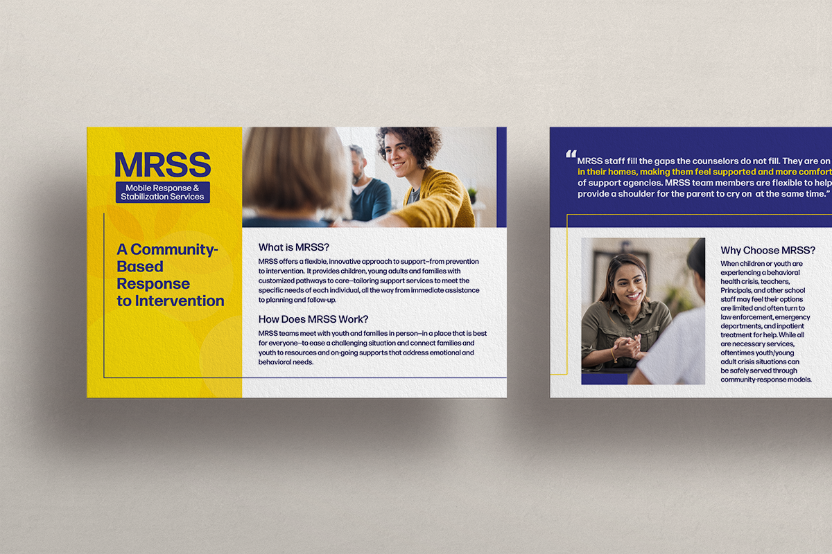
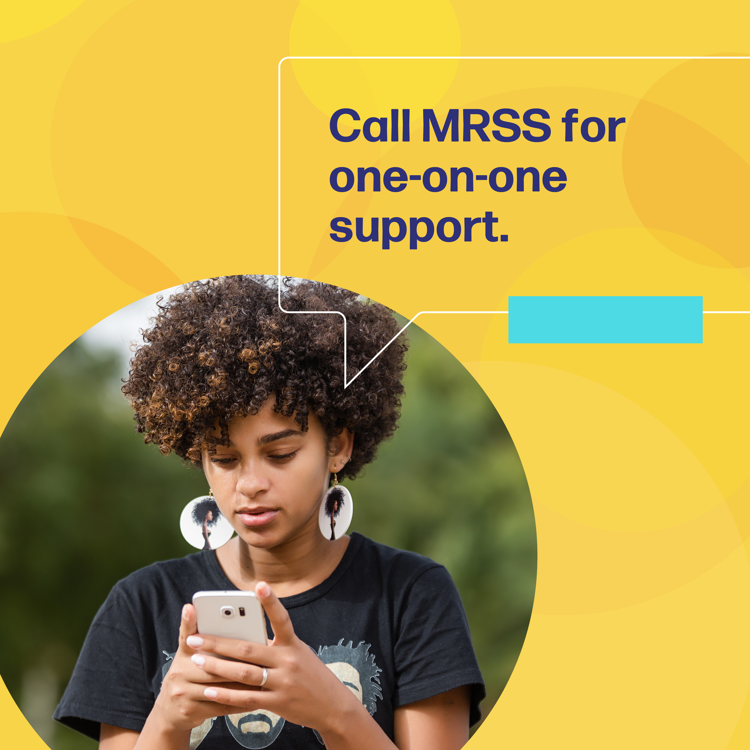
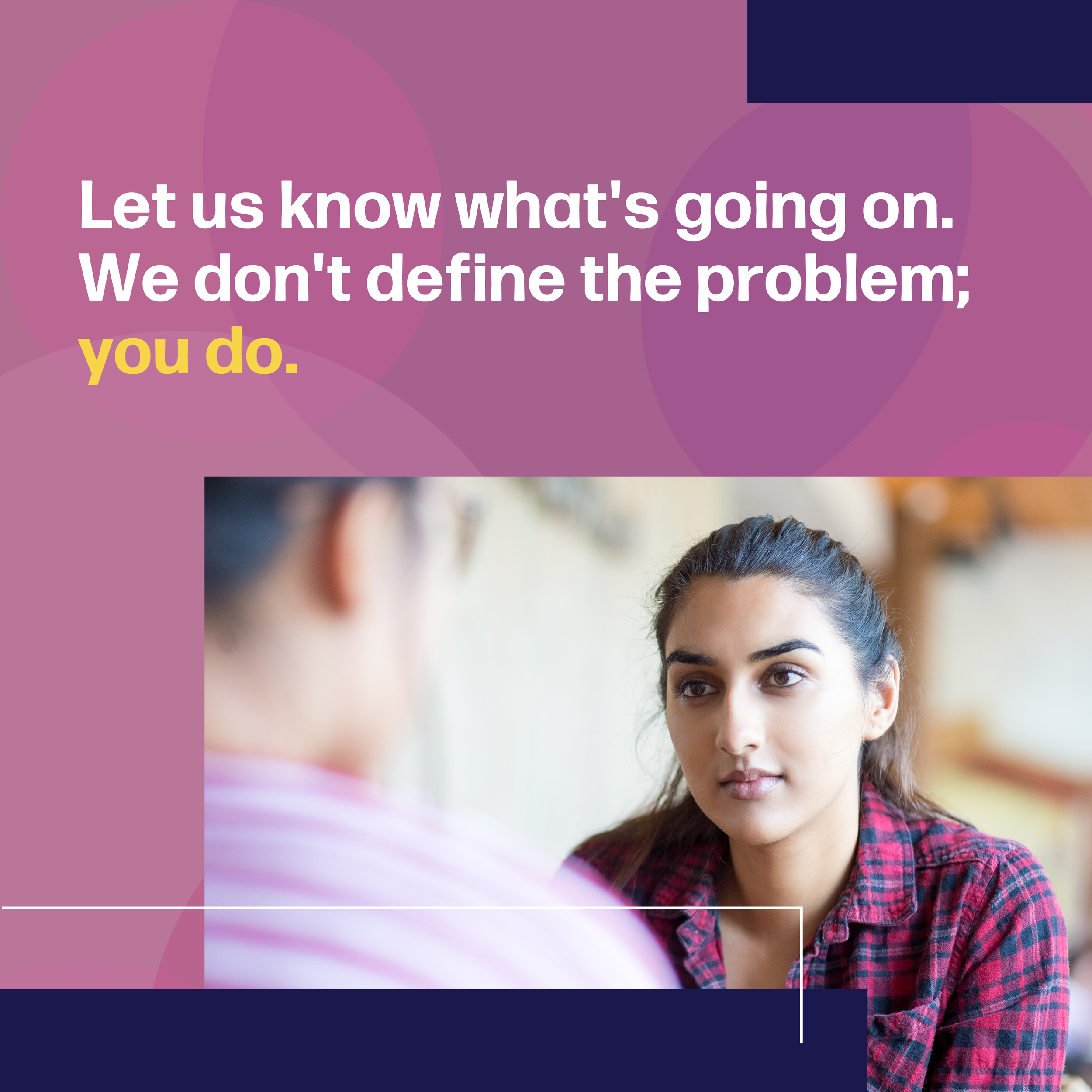
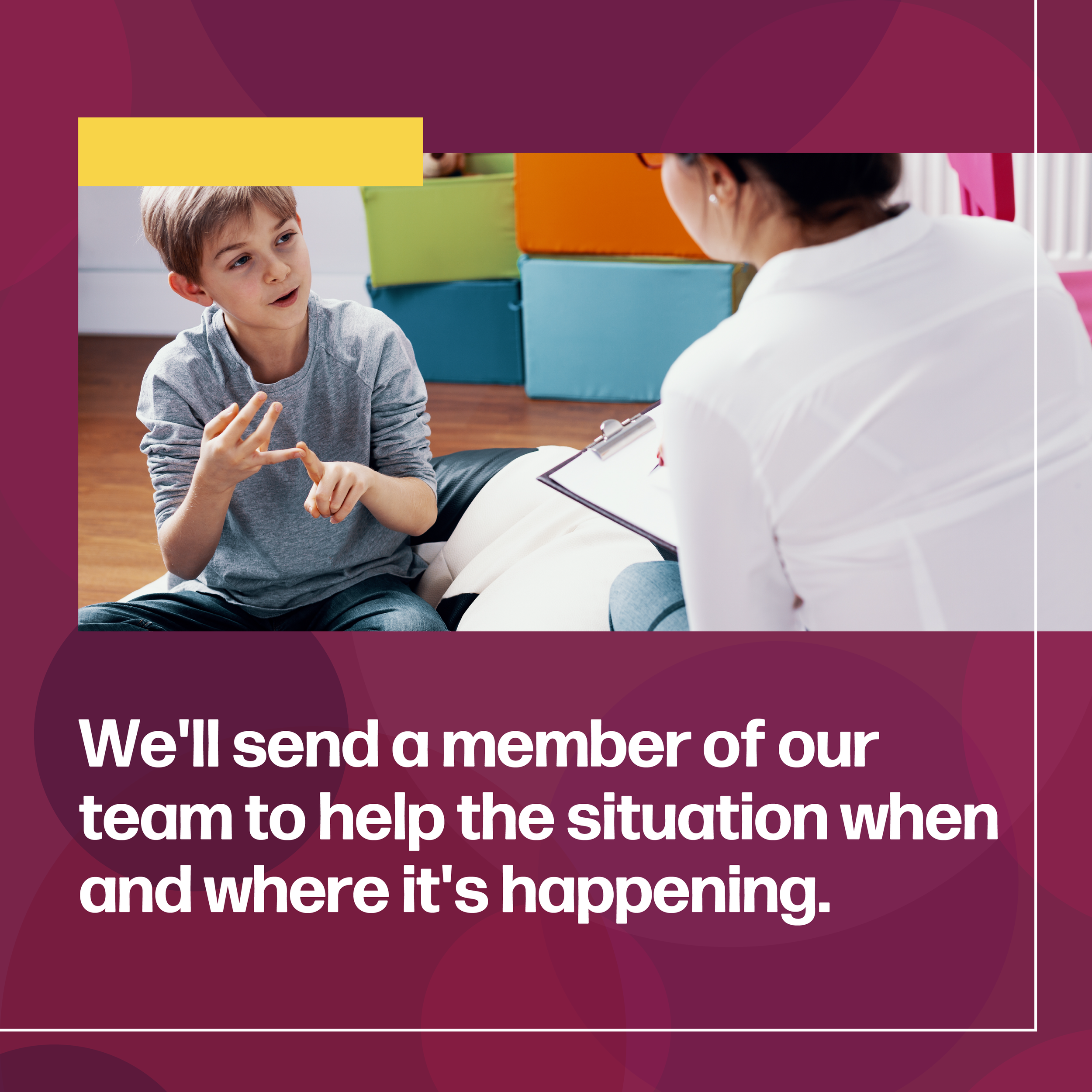
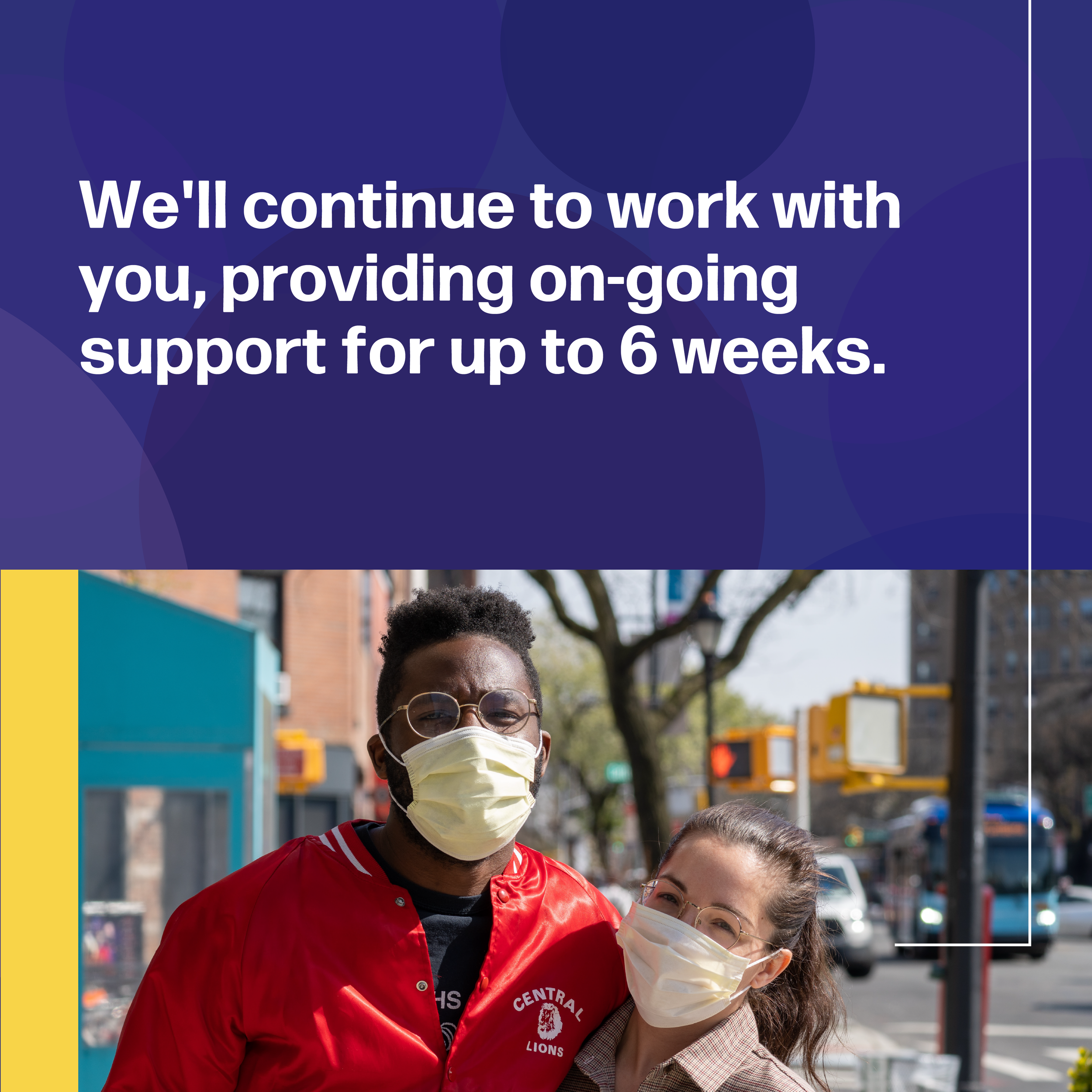
MRSS: Mobile Response & Stabilization Services
Public health campaign for a collection of northwest Ohio counties following the global pandemic. MRSS helps children, youth, and their families who are experiencing an emotional or behavioral stressor by interrupting immediate crisis and ensuring youth and their families are safe.
Marketing Materials ➤ I developed the color palette, type styles, and visual approach, which we adapted to county-specific print materials, including one-pagers, calling cards, and palm cards, as well as a targeted social media ad carousel


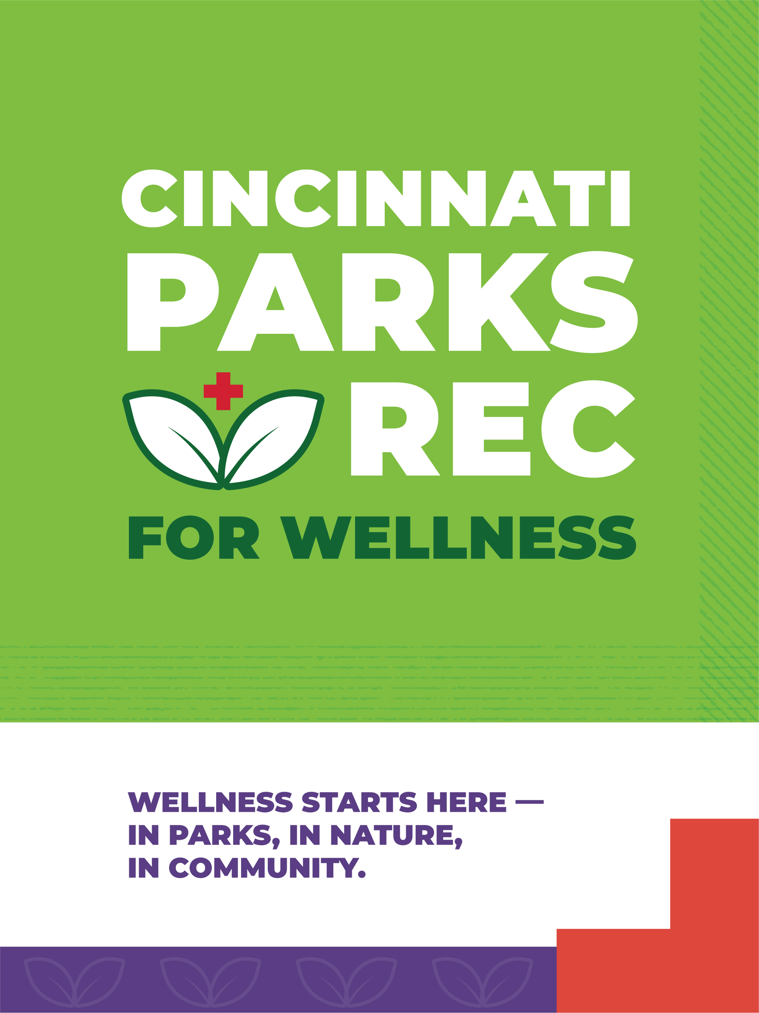
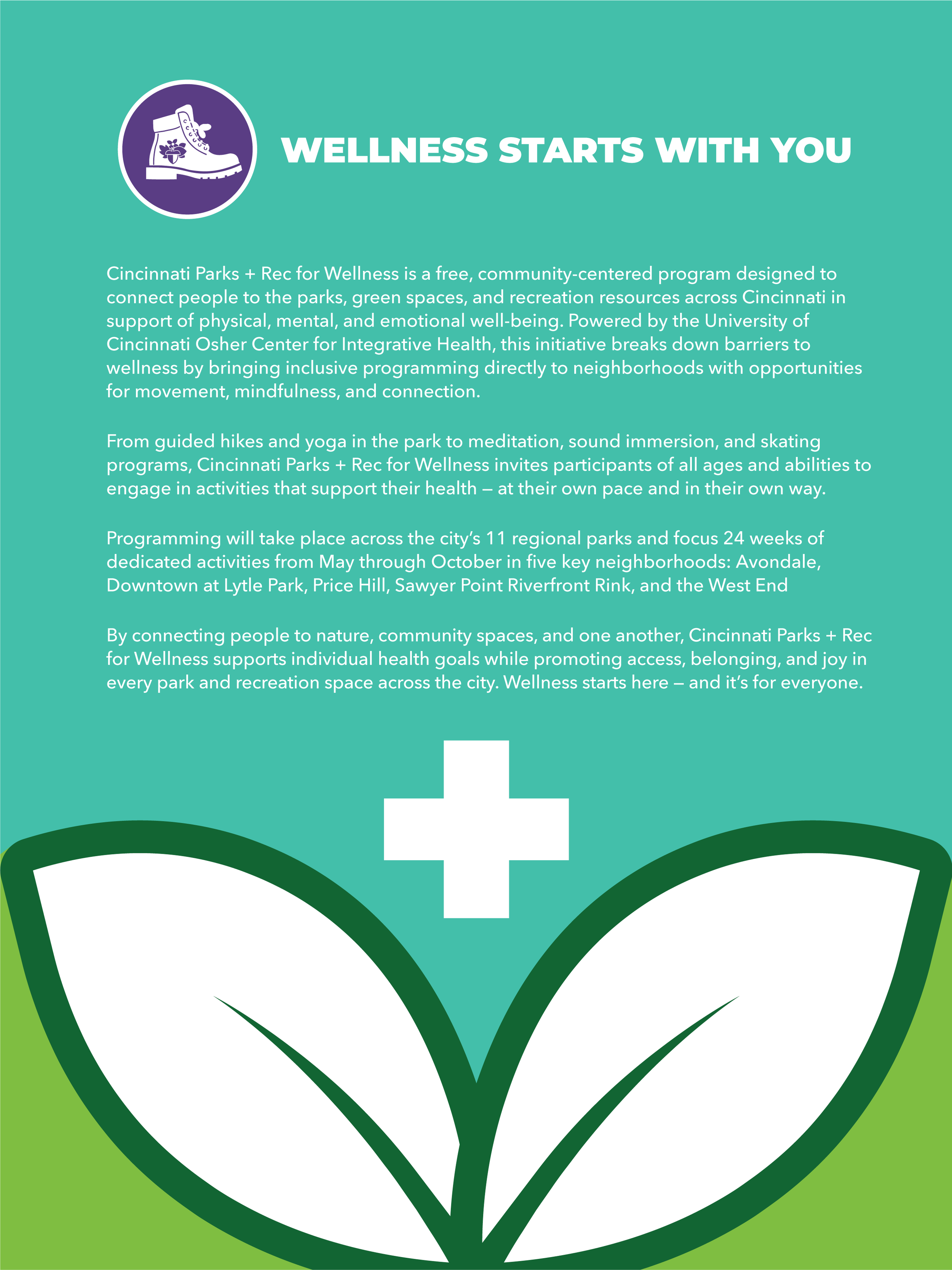
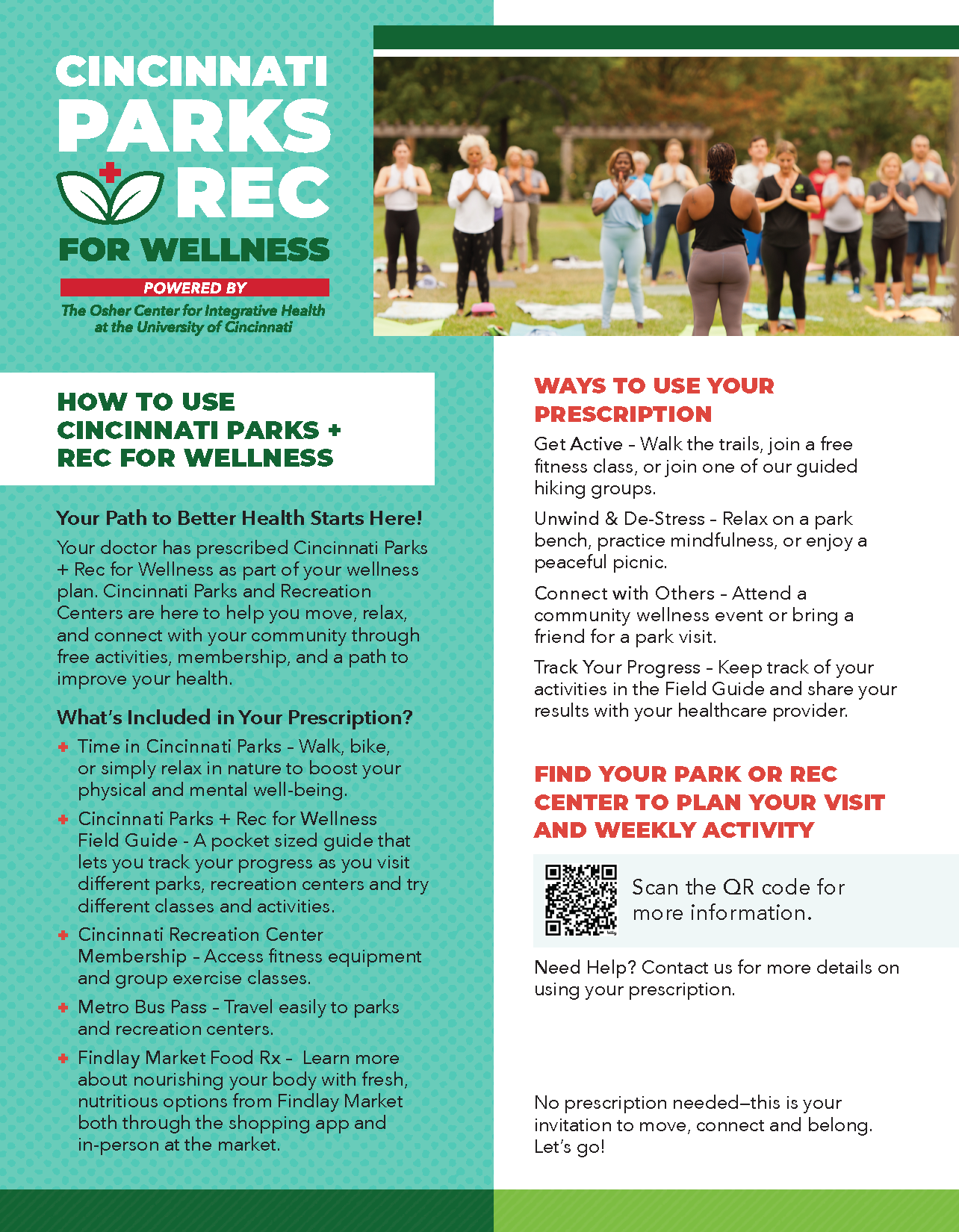
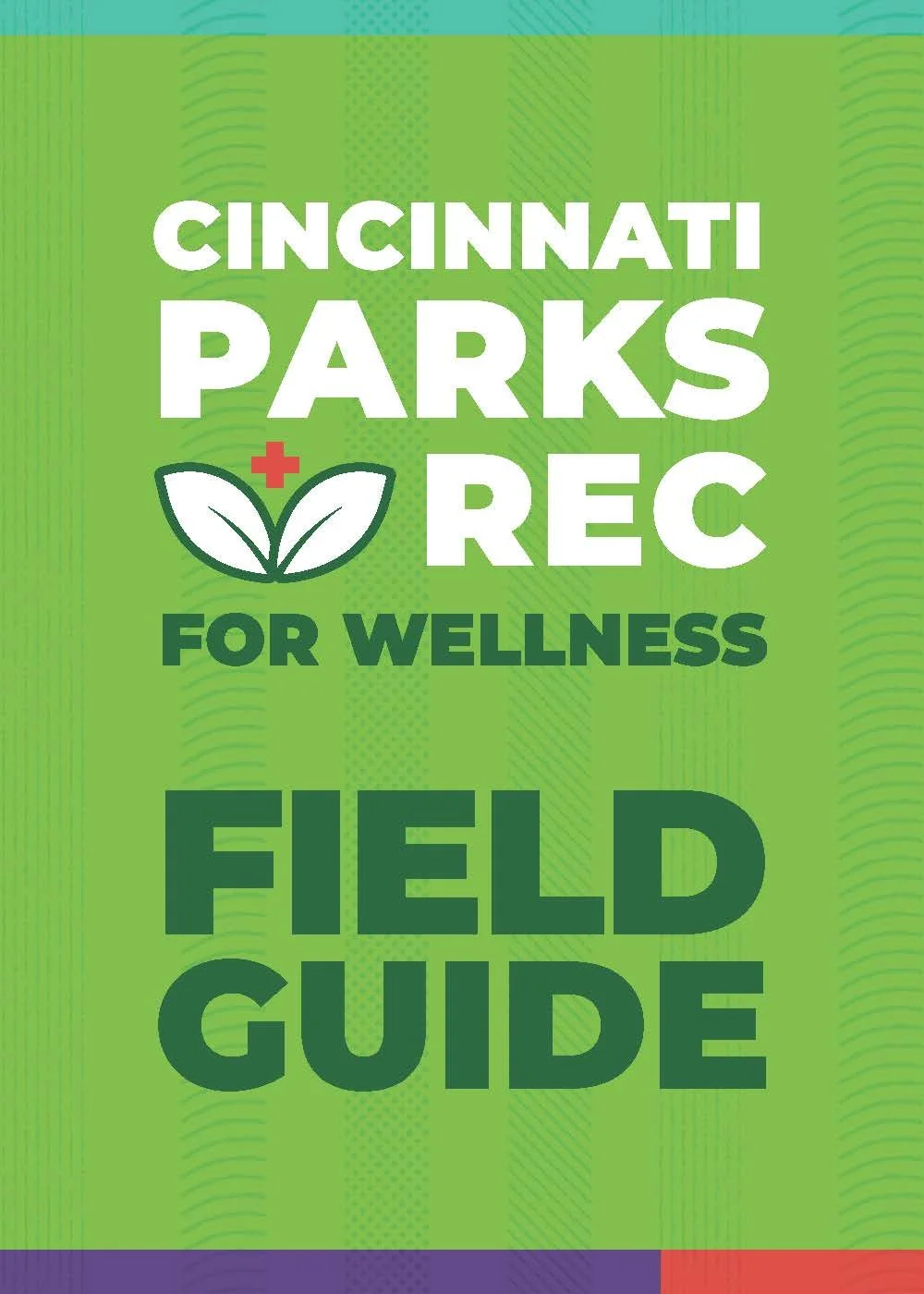
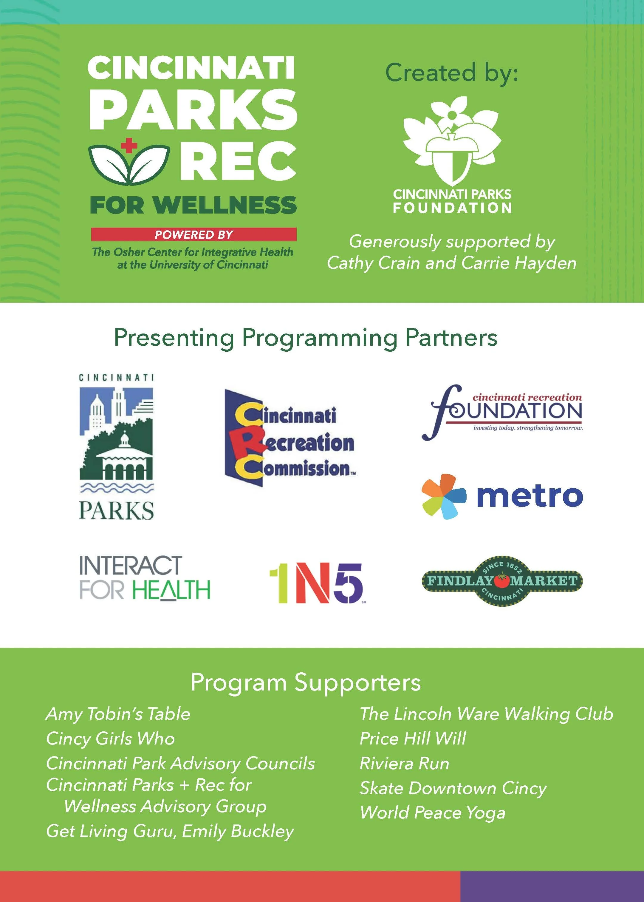
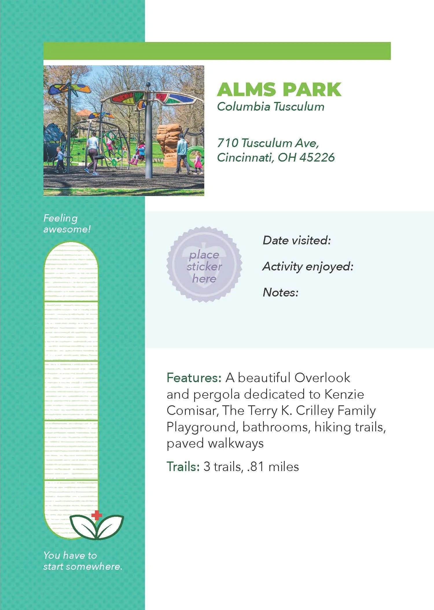
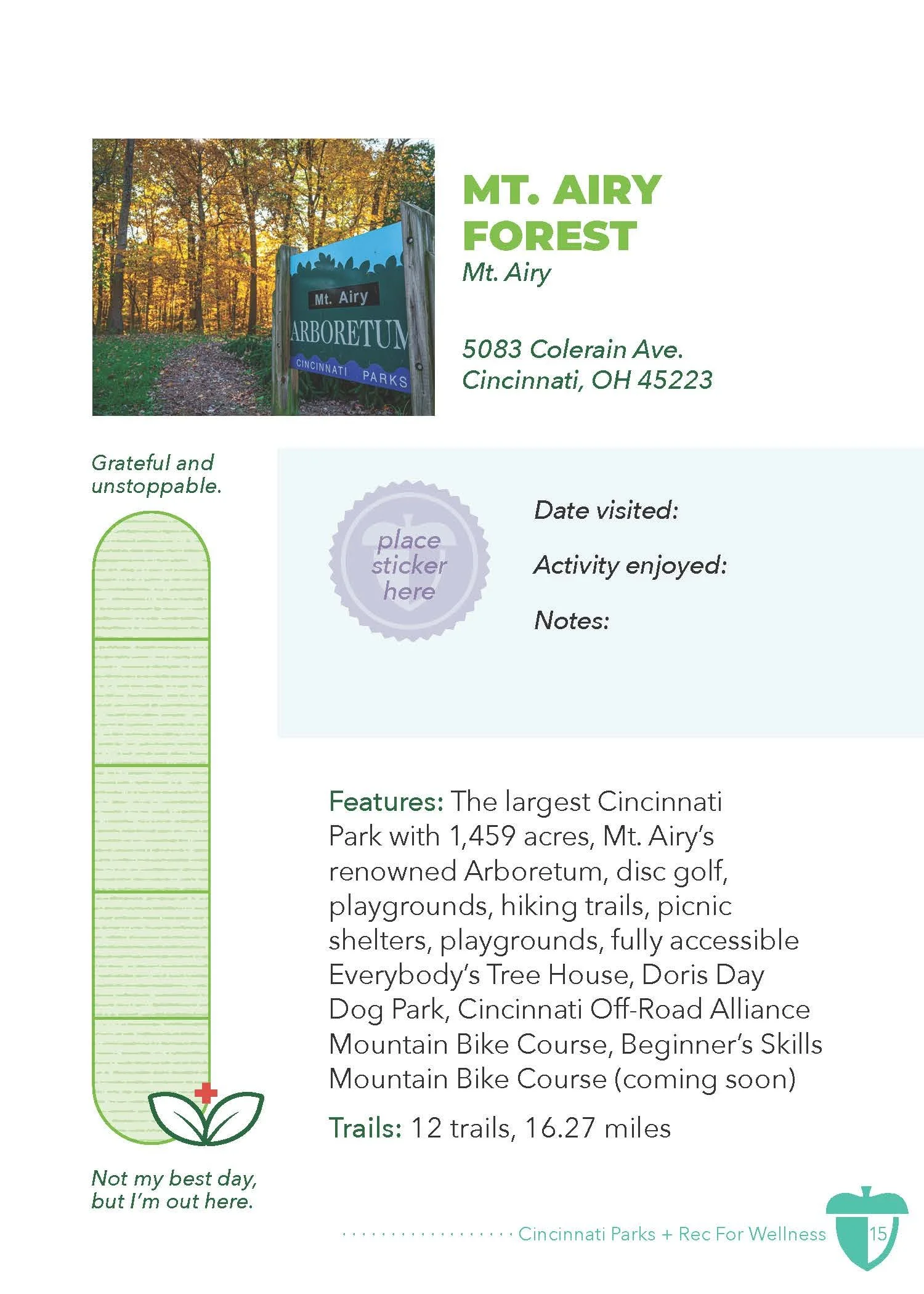
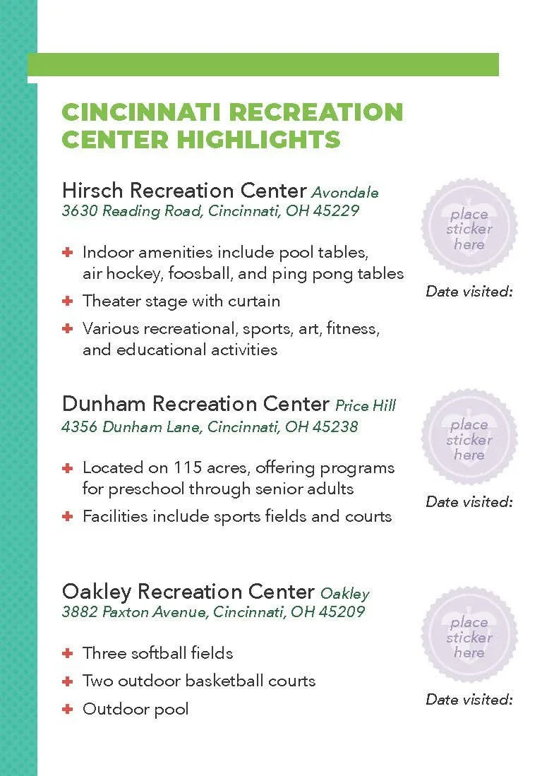
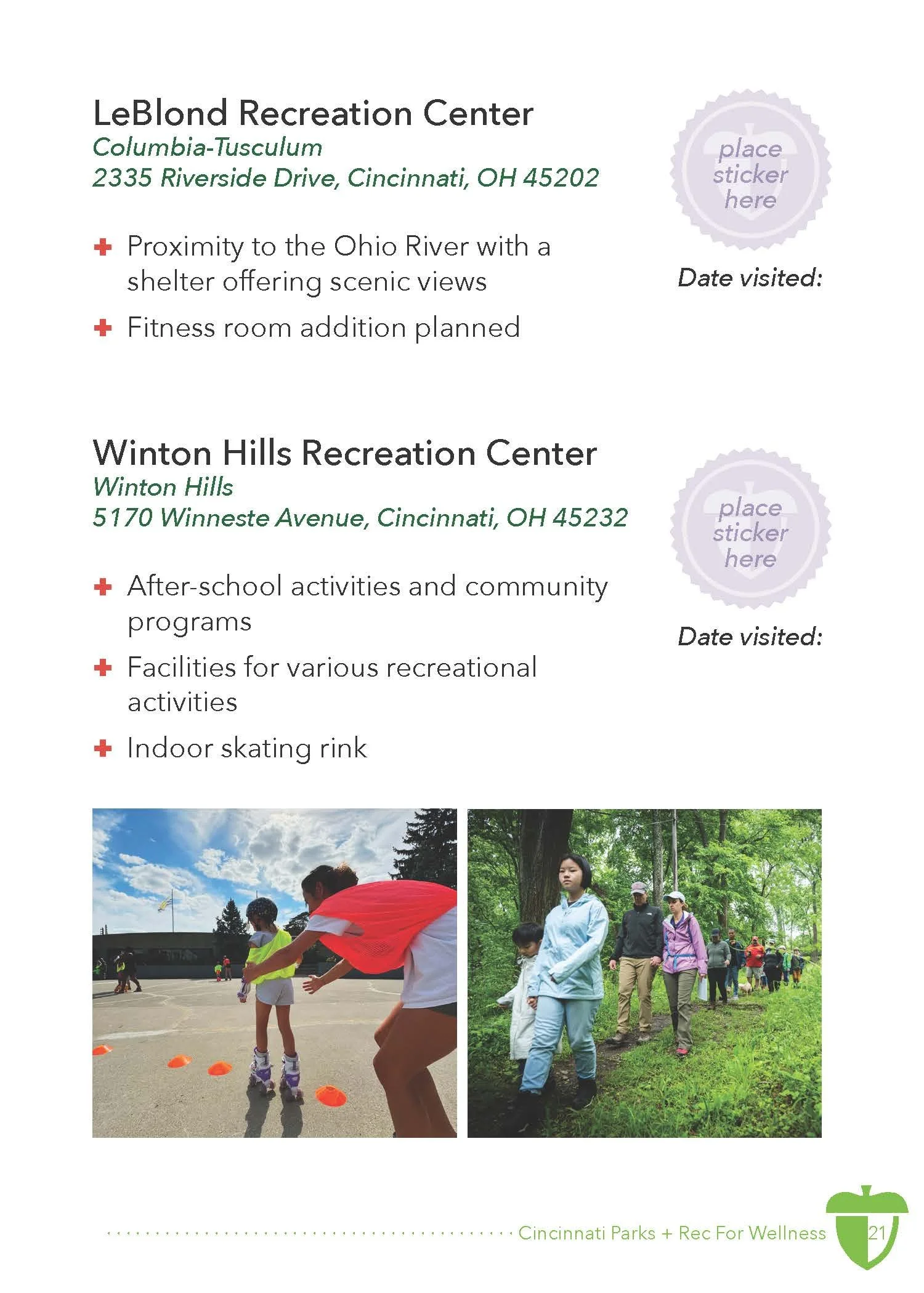
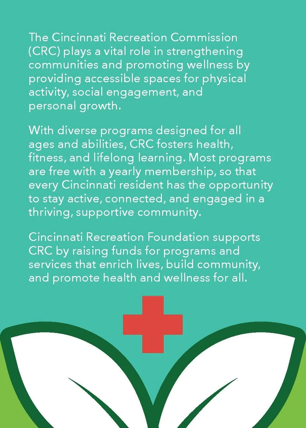
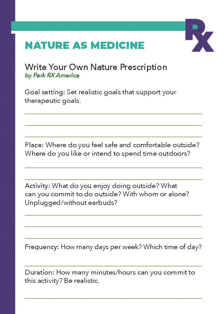
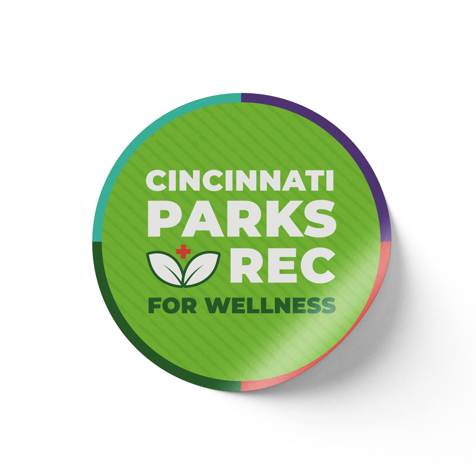
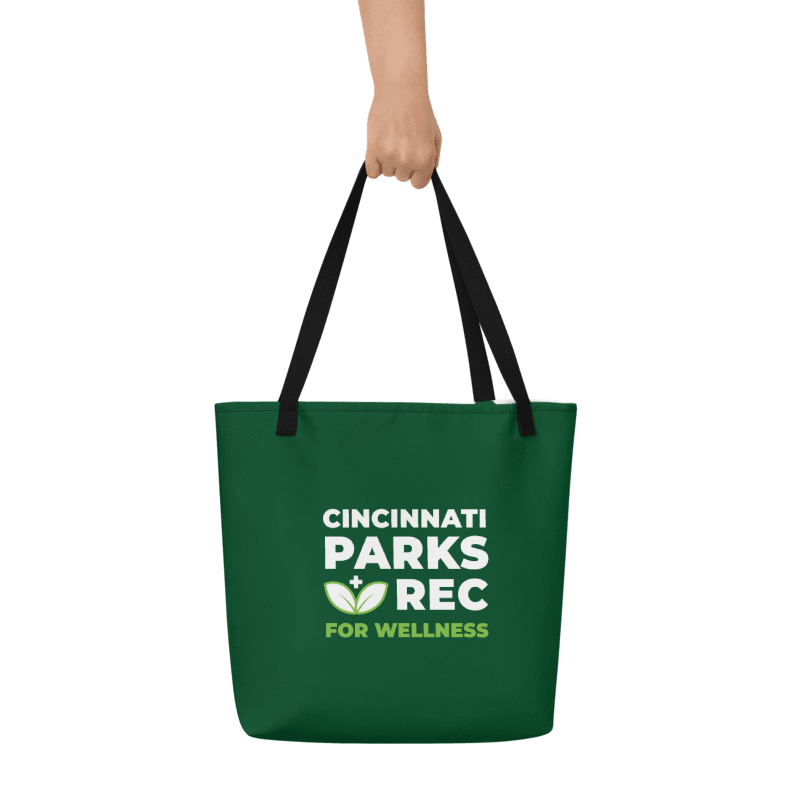
The Cincinnati Parks Foundation and the Cincinnati Recreation Center partnered to develop a program that encourages folks of all ages and abilities to explore parks they haven’t visited yet and provides resources for getting out and staying active.
Branding ➤ I created the logo, icons, and color palette with consideration to how it would play with other Cincinnati Parks Foundation campaigns, adding University of Cincinnati red as an accent as a nod to the Osher Center’s sponsorship
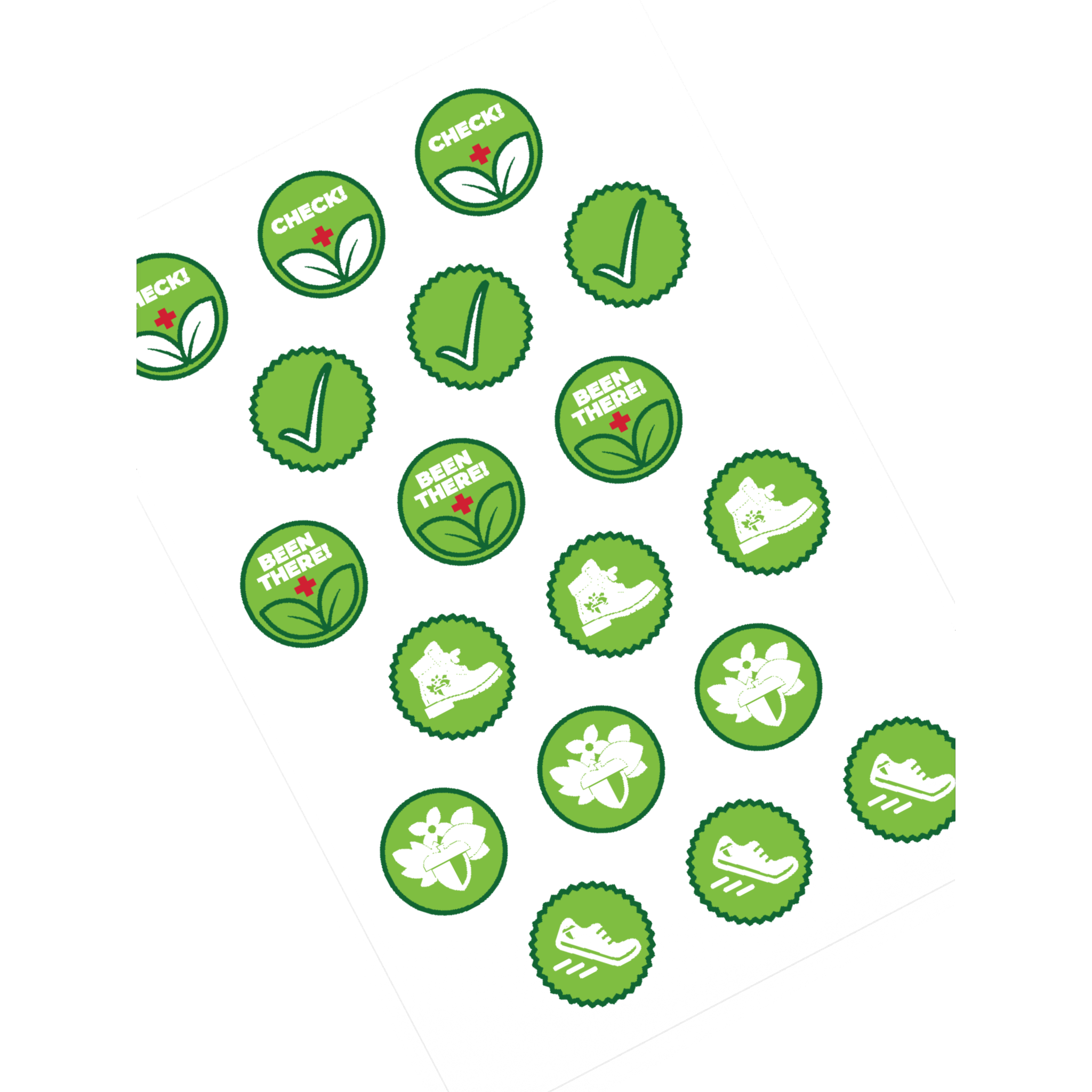
Campaign Materials ➤ This campaign existed wholly in printed materials for program participants, including an interactive program booklet and corresponding sticker sheets, tucked into a custom folder with a large water bottle sticker, all delivered in branded tote bags with the campaign logo
Cincinnati Parks + Rec for Wellness
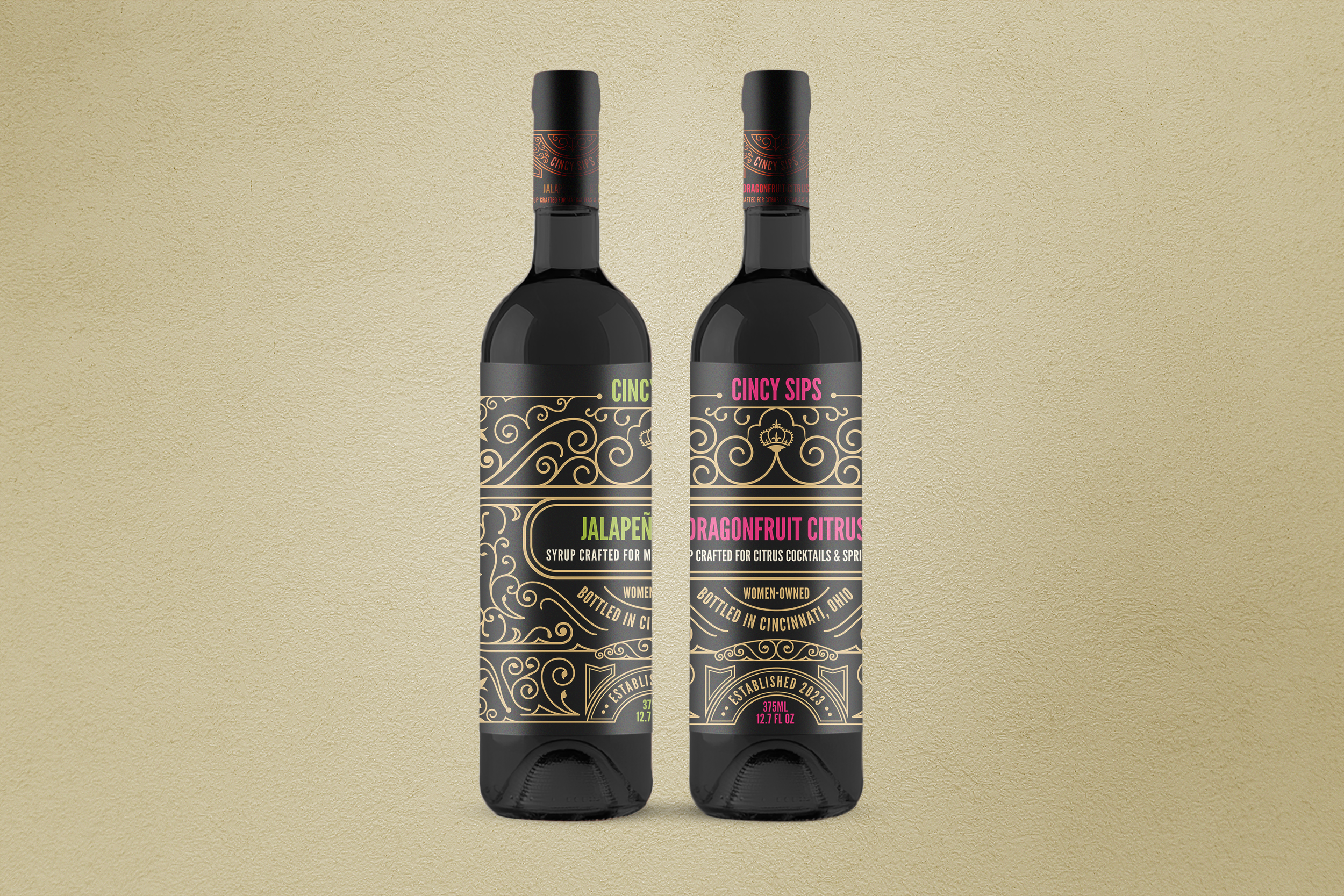
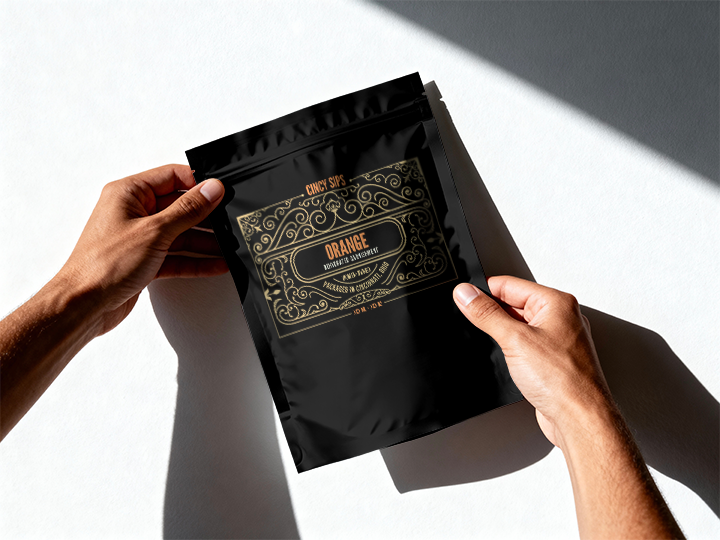
CincySips
CincySips Experience Co Syrup Collection: These hand-crafted cocktail syrups and packaged dehydrated garnishes support the company’s goal of bringing premium cocktail-first experiences through a local and women-owned brand, where modern mixology meets boutique design.
Packaging Labels ➤ This project had less than a week turnaround, in which I took the prompt “classy art deco, ornate frames, gold foil, identifiable flavors“ to create a templated label design for syrup bottles, which we modified to fit on miniature labels for 1oz sampler bottles, and smaller labels for dehydrated cocktail garnishes
Design for Print
Assorted reports and brochures for a variety of clients, including Donovan Energy, Fernside Center for Grieving Children, the Northeast Ohio Medical University, ArtWorks, and the Women’s Fund of the Greater Cincinnati Foundation.
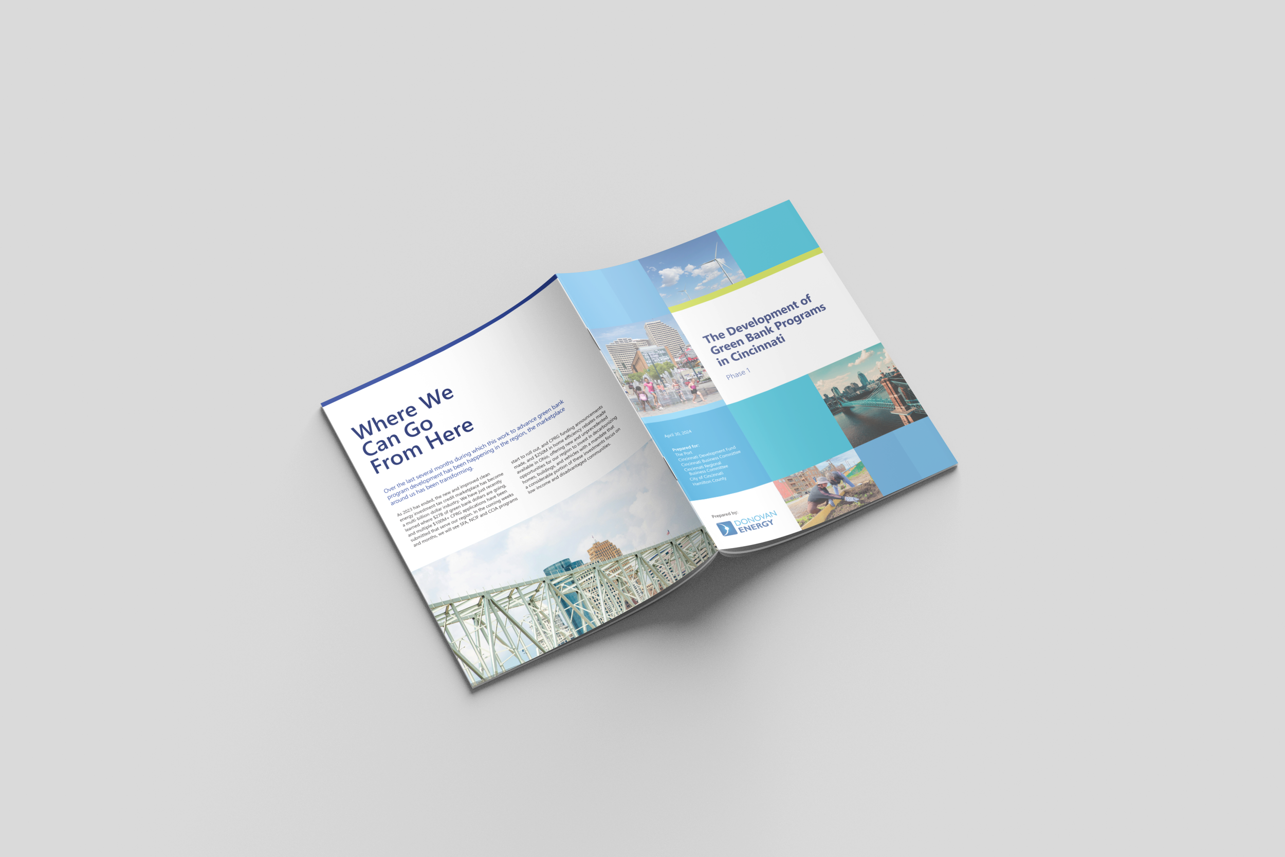
Donovan Energy (DE) Greenbank Report Phase 1 ➤ I combined an expanded DE color palette and clean type styles with a provided brand photo library and carefully selected stock imagery to artfully present this initiative recap report
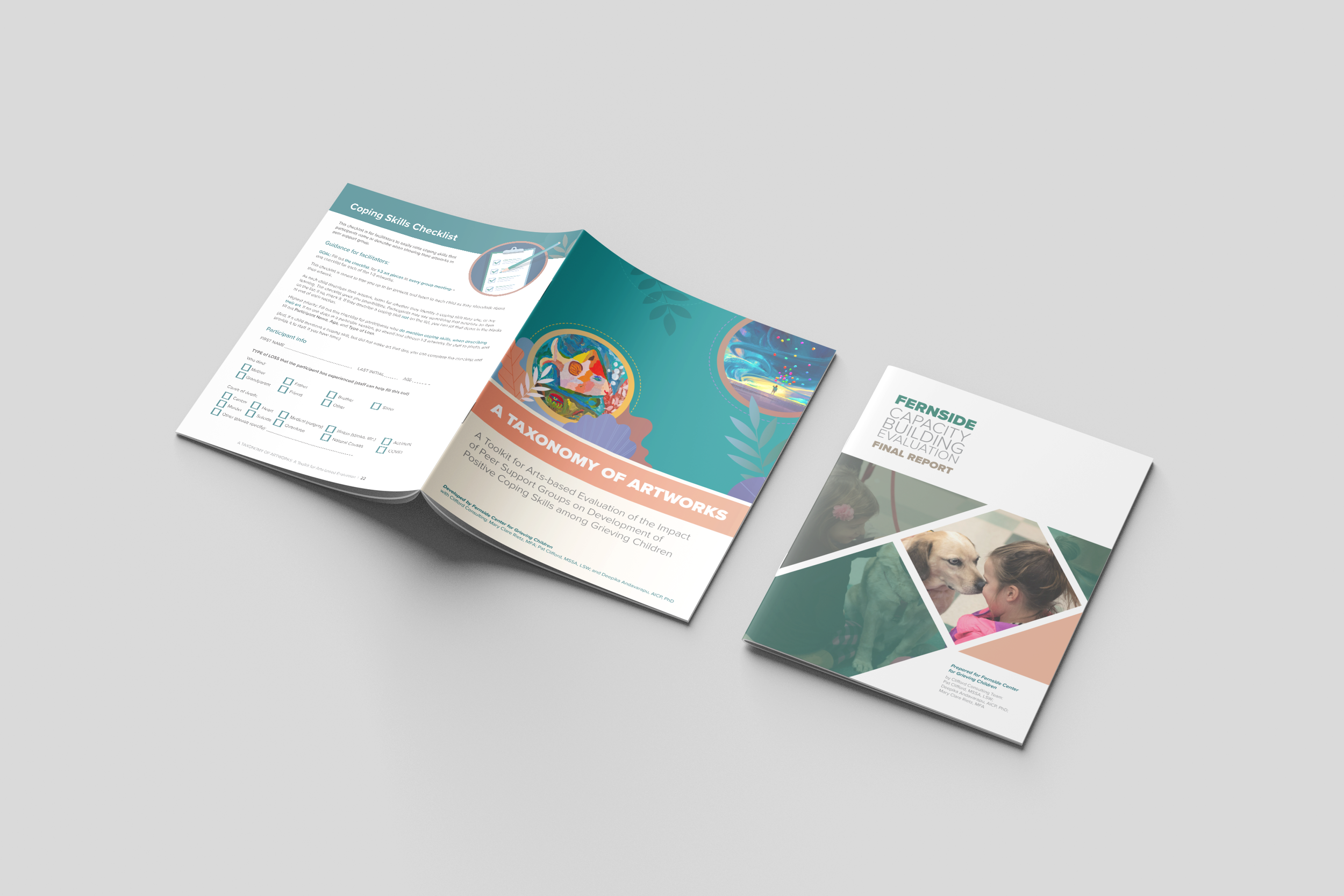
Fernside Report and Toolkit ➤ I applied Fernside’s color palette and preferred approaches for iconography to an annual report, inserting whimsy through illustrations, callouts, and infographics, as well as a toolkit for service providers that includes photos of the kids and their therapy art
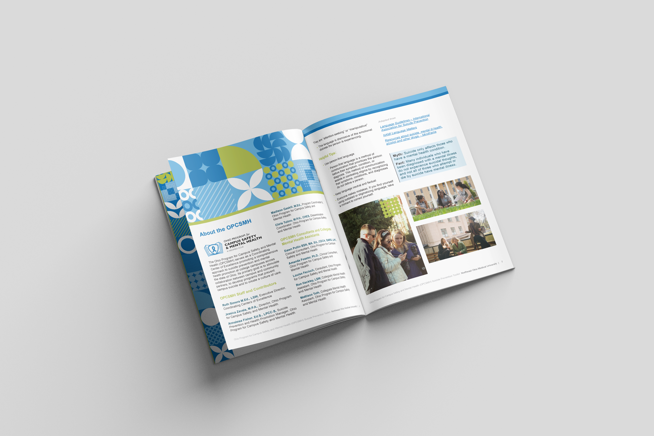
NEOMED Suicide Prevention Toolkit ➤ I developed a quick, flexible icon-based approach for a toolkit for the Ohio Program for Campus Safety & Mental Health, using abstract icons as textures, image frames, and overlays to pair with a limited bright color palette and royalty free stock images
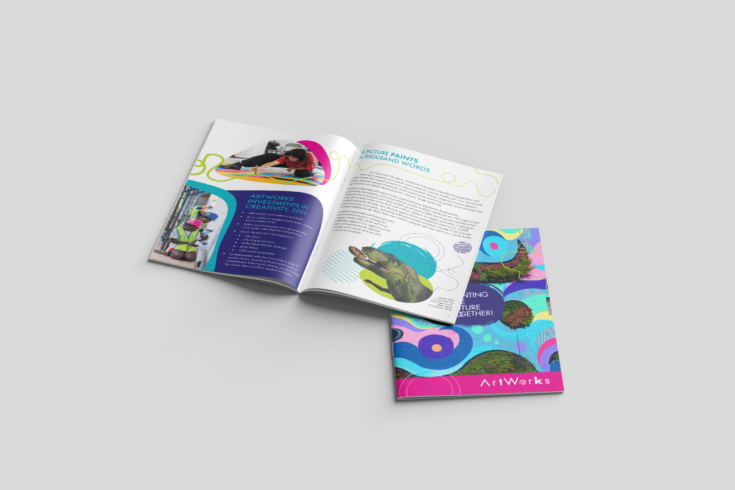
ArtWorks Painting the Future Together! Campaign ➤ I took the logo, color palette, and style board that my creative director developed and created a booklet and stationery set for this capital fundraiser campaign, bringing bright, pop-y colors and photographs of mural projects to life
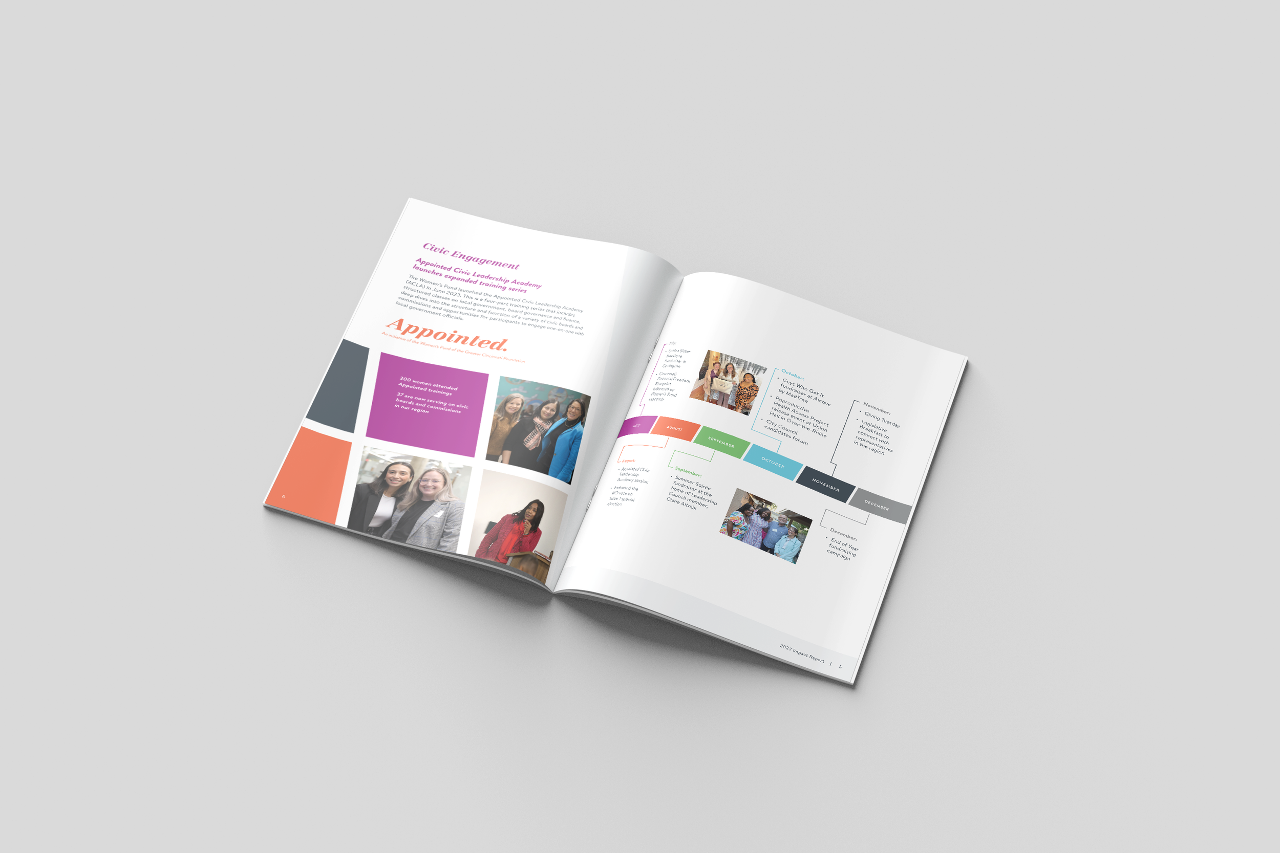
The Women’s Fund of Greater Cincinnati Annual Report ➤ I’ve created three annual reports for the Women’s Fund, establishing photo frames and design accents based on the icon of their logo, with consistent application of color and type styles based on their brand guide